Introduction
Seven was designed as part of the Drupal 7 UX initiative. It was the default administrative theme for Drupal 7, 8, and 9. In Drupal 10, it was replaced by Claro as the default theme. Some Drupal 10 websites may require or prefer Seven, now available as a contributed theme.
Claro, on the other hand, is a modern, responsive, and accessible Drupal admin theme. It has been the default theme since Drupal 9.4 and is designed to provide a better user experience for administrators. The theme focuses on improving accessibility, performance, and customization options.
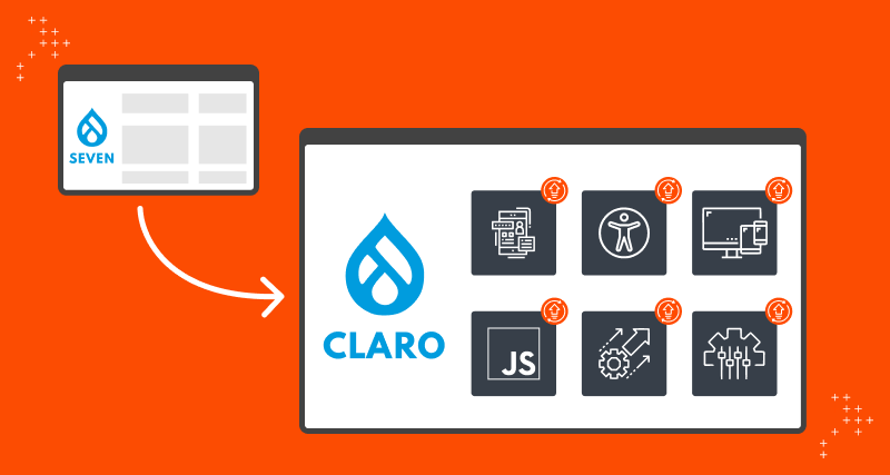
Changes From Seven To Claro
With the shift from Seven to Claro, several new features were added. Some of these key features are:
1. Enhanced User Interface Design
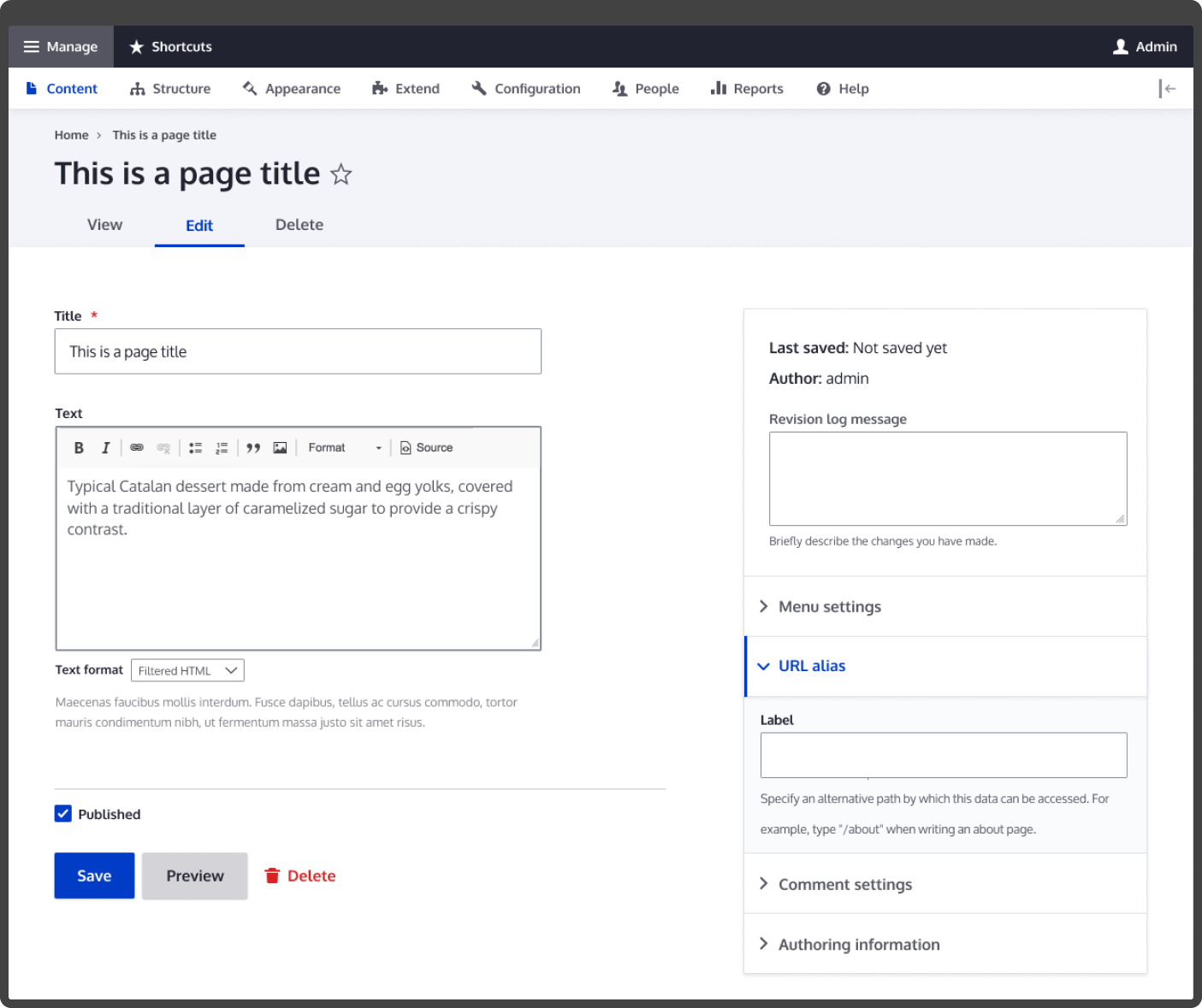
Claro has a refreshed, modern look and feel. The theme comes with updated icons and improved accessibility features. Claro features a clean, minimalist design emphasizing whitespace, which helps reduce visual clutter and makes it easier for users to focus on the content.
In comparison, Seven had a more traditional, practical design focusing on simplicity and functionality. While Seven was functional and effective, Claro takes a more modern approach to UI design, making it a more visually appealing and accessible choice for Drupal administrators.
2. Improved Accessibility
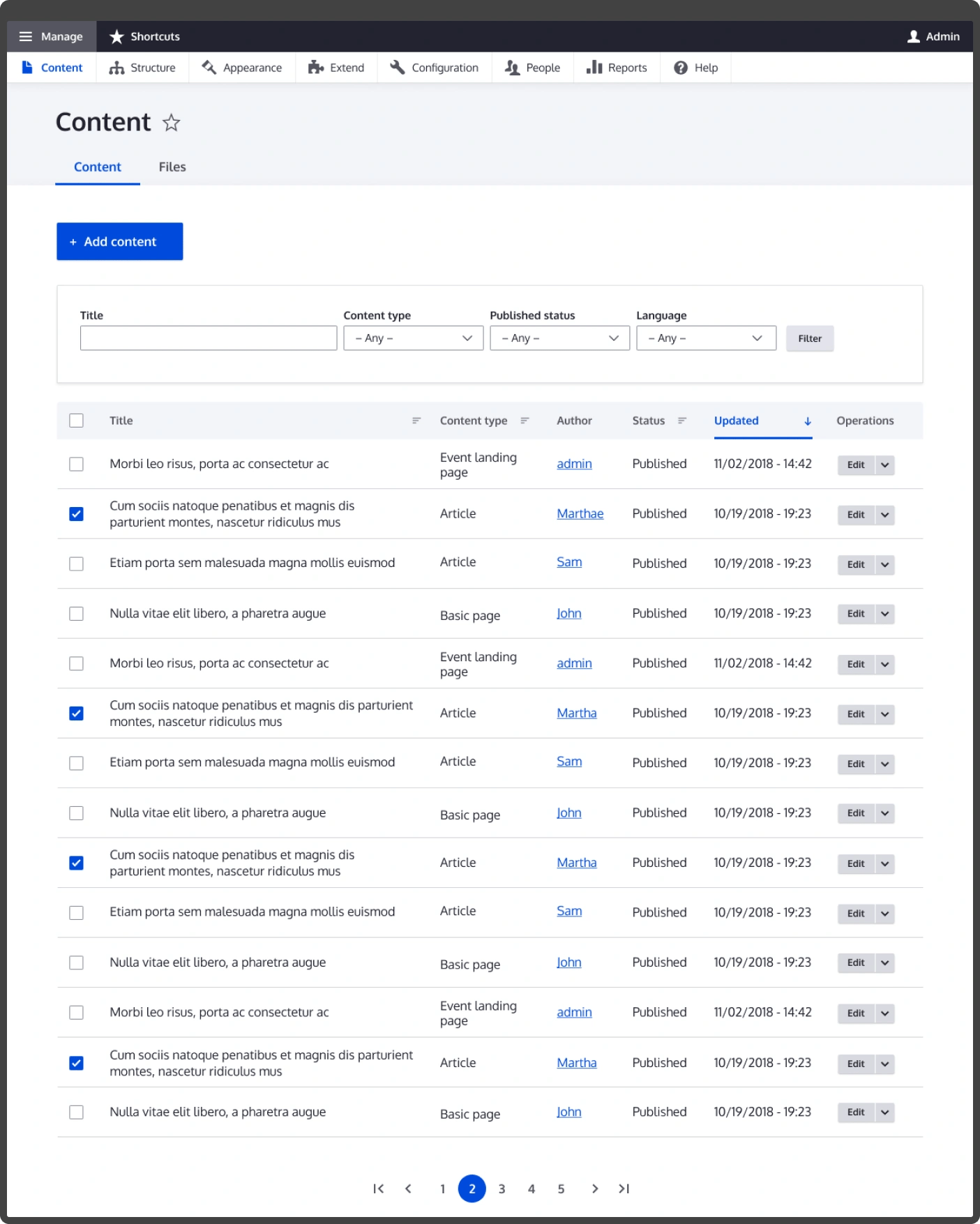
Claro has better support for keyboard navigation, screen readers, and other assistive technologies.

- Keyboard Navigation: Claro makes it easier for users with disabilities or who prefer to use the keyboard to navigate the admin interface.
- Screen Reader Support: Visually impaired users can easily access content and functions of the admin interface.
- Improved Color Contrast: Claro has improved color contrast, making it easier for users with color blindness or low vision to distinguish different interface elements.
- Semantic HTML: Claro uses semantic HTML to ensure that the structure of the page is conveyed to assistive technologies. This makes it easier for users with disabilities to understand and navigate the content.
- Accessibility Testing: Claro has been thoroughly tested for accessibility, focusing on ensuring that it meets the standards set by the Web Content Accessibility Guidelines (WCAG).
While Seven was still functional for most users, Claro represents a significant improvement in accessibility and usability for users with disabilities.
3. Responsive Design
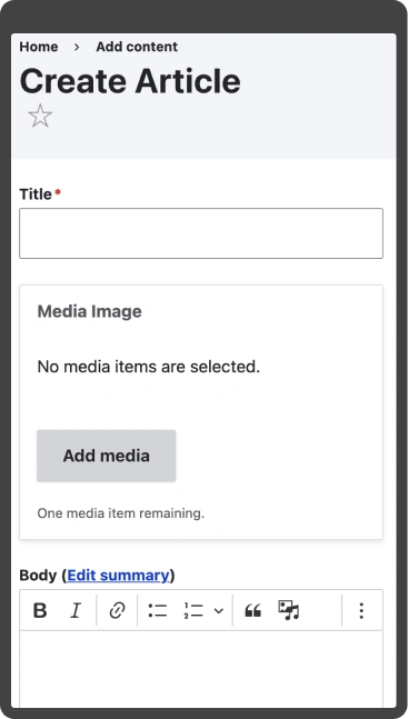
Claro has a responsive layout that adjusts to different screen sizes. Its responsive design is a significant improvement over Seven as it provides benefits like:
- Optimized For Small Screens: Claro has been optimized for smaller screens and mobile devices due to its responsive layout.
- Fluid Grid Layout: Claro uses a fluid grid layout, which adjusts dynamically to the size of the screen, ensuring that the content is presented in a clear, accessible way on all devices.
- Improved Navigation: Claro has improved navigation for smaller screens as it comes equipped with a more intuitive layout. This feature allows users to access the functions they need on the go.
Seven was not optimized for smaller screens and did not feature a responsive design. This meant that users accessing the admin interface on a mobile device or smaller screen would experience a less accessible, less usable interface. The content and functions also took a lot of work to access and navigate.
4. New JavaScript Enhancements
Claro comes with new JavaScript interactions, such as dropdown menus, modals, and tabbed interfaces.
- Dropdown Menus: These menus allow users to access sub-menus and functions with a single click.
- Modals: Claro uses modals to display important content or functions, such as confirmation dialogs or form inputs.
- Tabbed Interfaces: Tabbed interfaces organize content and functions, making switching between different tasks easier.
- Better Interactions: Claro comes with improved interactions, such as hover effects and animations, which enhance the user experience and make it easier for users to understand how to interact with the interface.
Seven was functional and practical, but Claro introduced a range of new interactions and features that enhance the user experience and make it easier to access functions.
5. Enhanced Performance
Claro has been optimized for performance, focusing on faster load times and reduced resource usage.
- Minimized Resource Usage: This helps ensure that the admin interface remains responsive and fast, even on low-powered devices.
- Improved Caching: It helps reduce the amount of data that needs to be transferred and processed, resulting in faster page load times.
- Better Codebase: Claro is built using modern frontend technologies, such as CSS Grid and Flexbox, and includes updates to the underlying codebase to ensure compatibility with future versions of Drupal.
Claro represents a significant improvement in terms of performance and resource efficiency, making it a faster and more responsive choice for Drupal administrators.
6. More Customization Options
Claro provides more options for customization, including the ability to switch between light and dark modes. It also comes with the ability to apply custom styles and branding to the admin interface.
- Theme Settings: These settings allow administrators to change the appearance of the admin interface, like changing the color scheme or enabling/disabling certain features.
- Custom CSS: Claro includes custom CSS support, allowing administrators to add personal styles to the admin interface.
- Third-Party Plugins: Integrating Claro with third-party plugins and adding new features to the admin interface is easier.
Seven had limited customization options and did not include support for custom CSS or third-party plugins. On the other hand, Claro offers a range of customization options that make it easier for administrators to tailor the appearance and functionality of the admin interface.
7. Technical Updates
Claro includes updates to the underlying codebase to ensure compatibility with future versions of Drupal.
- Modern Frontend Technologies: Claro is built using modern frontend technologies, such as CSS Grid and Flexbox, which were integral in creating a responsive, accessible interface that is optimized for performance.
- Compatibility With Future Versions: Claro has been updated to ensure compatibility with future versions of Drupal, which will help ensure that the admin interface remains functional and effective for years to come.
- Better Code Structure: Claro has been re-architected to ensure a better code structure, making it easier for developers to customize the admin interface and extend its functionality.
Seven relied on an older codebase and was not optimized for accessibility or performance. Claro represents a significant update in terms of technology and accessibility, making it a more modern and accessible choice for Drupal administrators.
Conclusion
Claro is a clone of Seven but has been upgraded to include several modern features that allow users to feel comfortable while using the theme. In Claro, the appearance and behavior of components have been improved with instructions built into the interface.
The principles of design accessibility have been implemented while maintaining the look and feel of popular text editors. Claro stands for ‘clear’ or ‘clean’ in Spanish, and the theme strives to live up to its name.

Gaurav Mahlawat, Drupal Contributor
Enthusiastic about mythology and historical books, Gaurav loves to surf memes on the internet and watch crime thrillers and superhero movies. His life’s essential value? Hard work.
 We respect your privacy. Your information is safe.


Leave us a comment