What Is WCAG 2.2
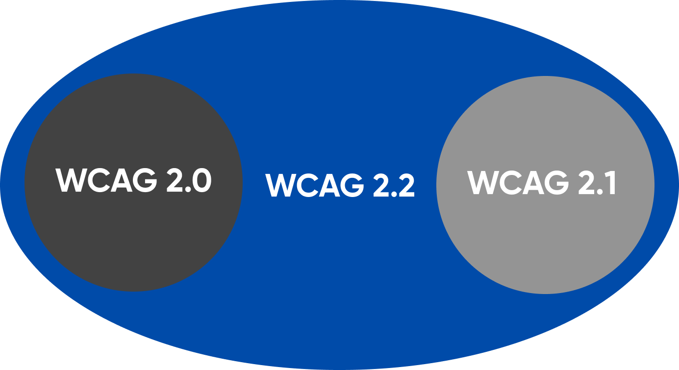
Web content should be accessible. This means that the information and operation of the user interface should be easy to comprehend. Web Content Accessibility Guidelines (WCAG) cover a wide range of recommendations, a collection of principles, guidelines, and success factors that make this happen. WCAG also has several versions, including:
- WCAG 2.0 with 61 success criteria
- WCAG 2.1 with 78 (61 + 17 new success criteria)
- WCAG 2.2 with 87 (78 + 9 new success criteria)
Check out this blog to learn more about WCAG 2.0 and 2.1. Keep reading here to learn more about WCAG 2.2, released on 6 September 2022.
WCAG 2.2 Specifications
WCAG 2.2 focuses on extending requirements for users with limited fine low vision, motor skills, and cognitive impairments. The success criteria of WCAG 2.2 focuses on:
- Accessible Authentication
- Accessible Authentication (No Exception)
- Consistent Help
- Dragging Movements
- Focus Appearance
- Focus Not Obscured (Minimum)
- Focus Not Obscured (Enhanced)
- Redundant Entry
- Target Size (Minimum)
Find more information about each success criterion, WCAG principles, accessibility testing, WCAG checklist, and conformance levels.
Accessible Authentication
This is one of the four principles of Web Content Accessibility Guidelines. It is understandable and has an AA conformance level.
It addresses the issue of how most websites rely on usernames and passwords for logging in. Similar issues can also be detected by engaging in accessibility testing.
Memorizing a username and password places a very high or impossible burden upon people with specific cognitive disabilities.
Real-Time Examples
- A website does not block paste functionality. The user can copy the login details and paste them right into a login form by saving it in a third-party password manager.
- The website uses the OAuth protocol, allowing users to sign in with a third-party source.
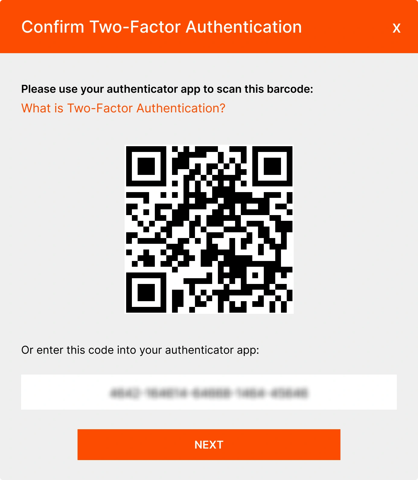
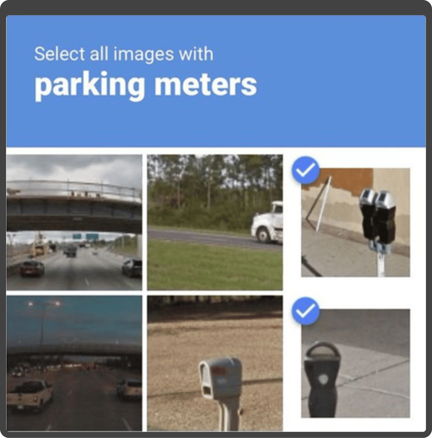
- A website that requires two-factor authentication displays a QR code that an app can scan on the user's device to confirm identity.
Success Criteria
- Include the ability to copy and paste from password managers or device authentication.
- Field inputs should allow the user's browser or extension to identify and fill in the username and password.
- Identify familiar objects wherever required.
Benefits
Implementing accessible authentication will ensure that individuals with cognitive problems, including dyslexia, dyscalculia, or perception-processing limits, can authenticate. This will happen regardless of the user's cognitive ability level.
Accessible Authentication (No Exception)
Accessible Authentication (No Exception) is an understandable WCAG principle with an AAA conformance level. It addresses the challenge of logging into a page or website for users who need help remembering their authentication details. These users may forget passwords, and the authentication process may involve a cognitive function test.
Real-Time Examples
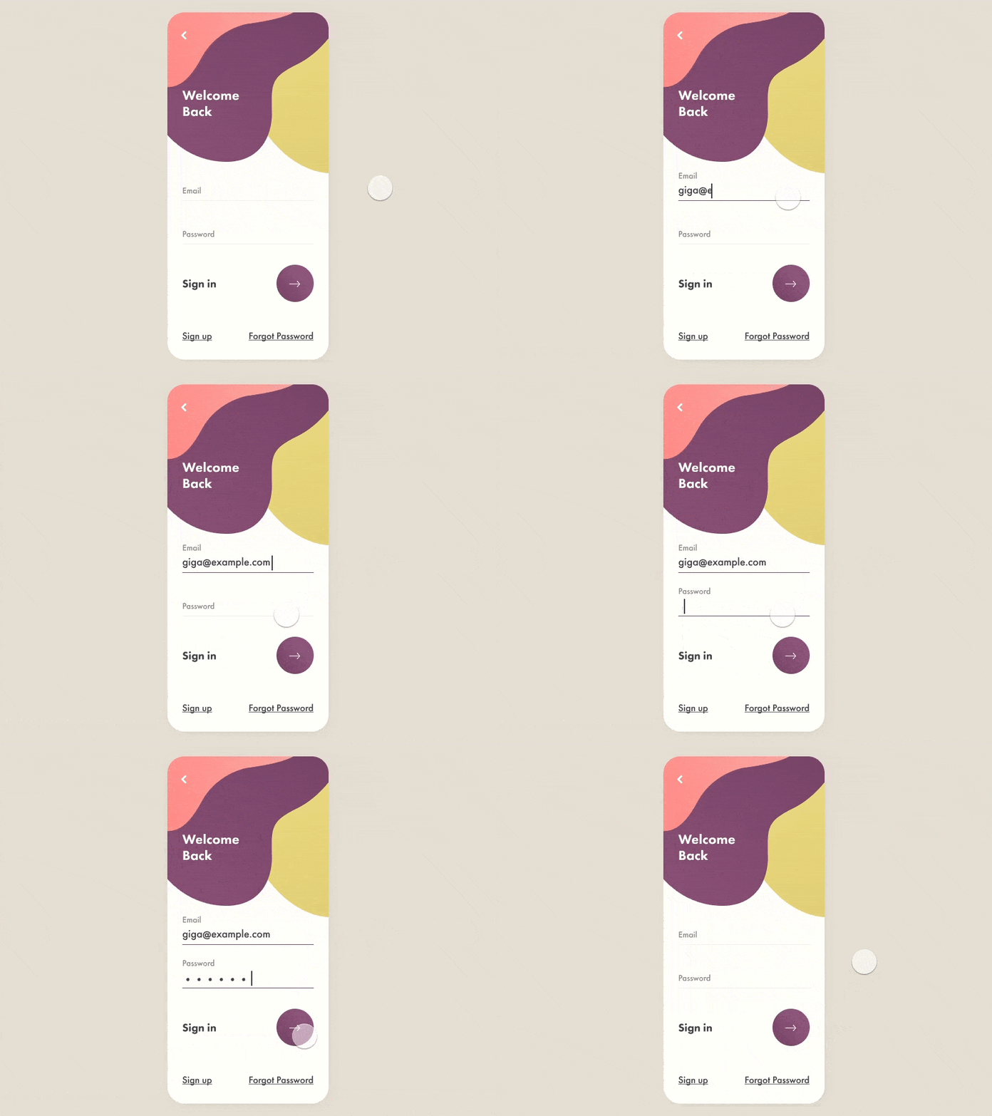
- A website uses a properly marked-up username (or email) and password fields as the login authentication. The username and password can be filled in automatically by the user's browser or a built-in password manager plugin from a third party.
- A website that requires two-factor authentication offers a variety of solutions for the second factor, such as a USB-based approach where the user enters a time-based token by pressing a button.
- A notice is delivered to a user's smartphone by a website that demands two-factor verification. The user must identify using the device's authentication mechanism, including a user-defined PIN, a fingerprint, or face recognition.
Success Criteria
- Include the ability for users to copy and paste from password managers or device authentication.
- Field inputs should allow the user's browser or extension to identify and fill in the username and password.
- It is similar to Accessible authentication (AA) except that this has no exceptions for object recognition tests.
Benefits
Implementing accessible authentication will ensure that individuals with cognitive problems, including dyslexia, dyscalculia, or perception-processing limits, can authenticate. This will happen regardless of the user's cognitive ability level. This is similar to Accessible Authentication except that it has no exceptions for object recognition tests.
Consistent Help
This WCAG principle is understandable and has a conformance level of A. It focuses on how users should be able to locate assistance when performing any tasks on a website. The assistance feature should be prominently and continuously visible.
Real-Time Examples
- Help options include contact details, a contact form, live chat, FAQs, or an automated chatbot.
- Online job applications might request an applicant's identification number. But one could have several and need to know which one to enter.
- While filling up a medical appointment scheduling form, the user might need help if the service one is trying to book is not easily findable within the interface.
Success Criteria
Easily accessible contact information like a phone number or email address, a direct link to an FAQ page, or a built-in messaging option like a client chat should be provided.
Benefits
When a user can quickly find help, they can complete the task even if they encounter challenges. It also helps people who may need assistance locating help that is not part of the page they are using.
Dragging Movements
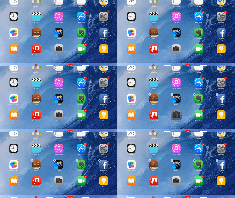
This is one of the four principles of Web Content Accessibility Guidelines. It is operable and has an AA conformance level. Here, dragging refers to the following process.
- Tap or click to define the starting point.
- Maintain contact-holding the press down.
- Move the pointer to a specific position.
- Release the press/hold in the desired position.
Dragging should only be involved if it is an essential part of the function.
Real-Time Examples
- A map allows users to drag the view of the map around, and the map has up, down, left, and right arrow buttons to move the view.
- After tapping or clicking on a list element, a sortable list of features may provide adjacent controls for moving the stuff up or down in the list by simply tapping or clicking on those controls.
- A radial control widget (color wheel) where the value is set by dragging the marker for the currently selected color to another position also allows picking another color value by tapping or clicking on another place in the color wheel.
Success Criteria
Enabling the keyboard with up, down, left, and right arrows. Buttons might also be provided on the screen with up, down, left, and right buttons to move the view, such as a map, sortable list, or columns in a Kanban view.
Benefits
Users who struggle with performing dragging movements can still operate an interface with a pointer interface.
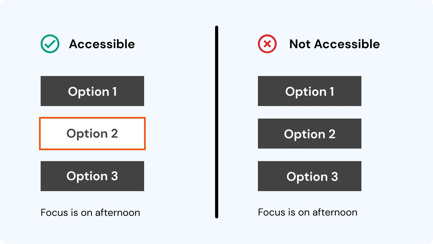
Focus Appearance
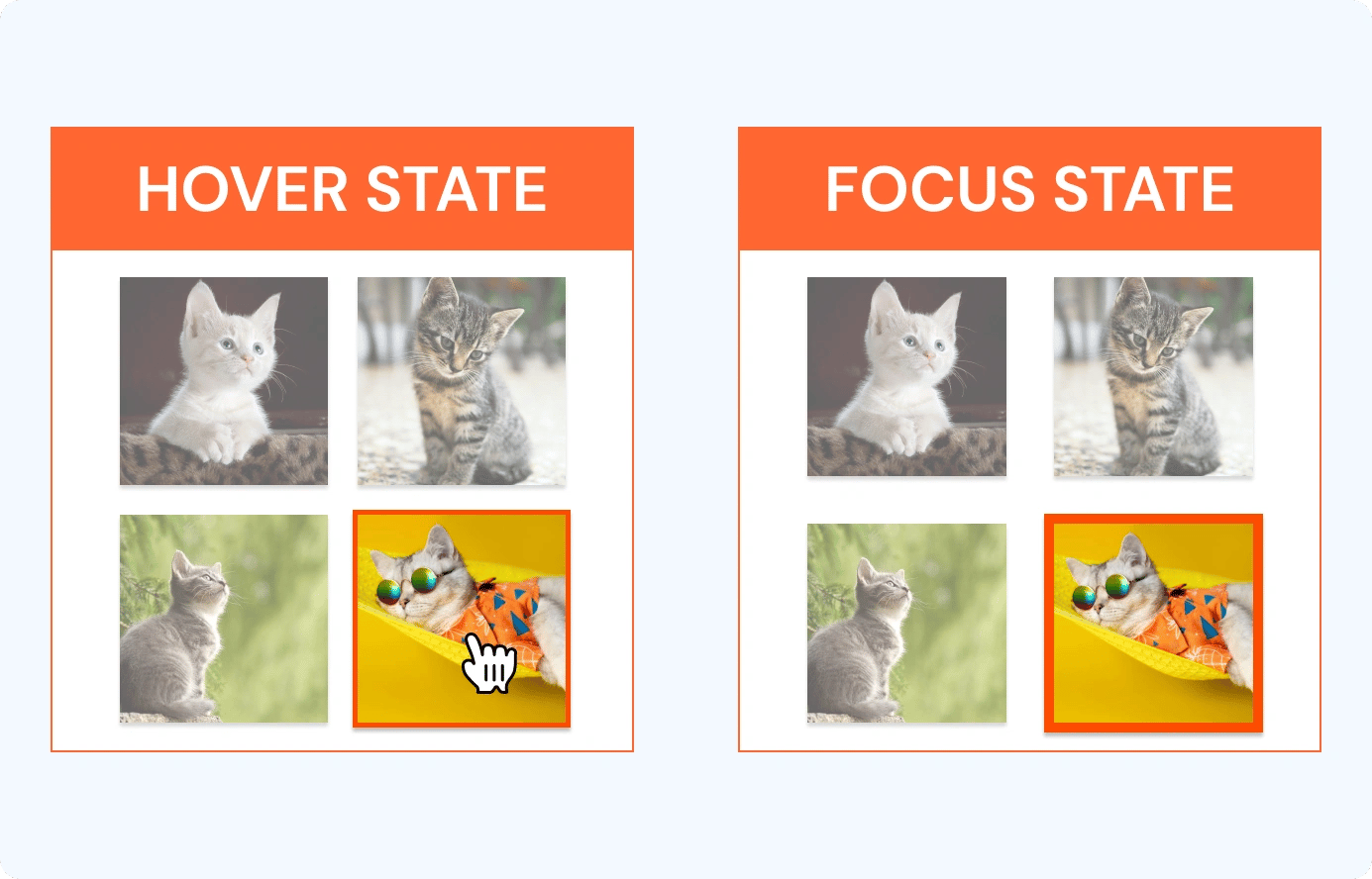
This WCAG principle is operable and has an AA conformance level. The focus is on people with mobility impairments who use alternative input devices besides a mouse. It is also relevant for people with low vision who should be able to view the current point of focus on a website.
Real-Time Examples
- An outline that contrasts with the button's backdrop highlight when a button is focused.
- When text fields receive priority, an outline is displayed around the area, indicating the input has focus.
- An outline is drawn around the control to show that the input has focus when radio buttons have given precedence.
Success Criteria
- Include a thick border around the element or significant changes to the background color.
- An indicator with a 3:1 contrast ratio with the adjacent colors of the component.
Benefits
People with attention limitations, short-term memory limitations, or limitations in executive processes benefit by discovering where the focus locates.
Focus Not Obscured (Minimum)
This WCAG principle is operable and has an AA conformance level. The principle is built to help low-vision users who use a keyboard to navigate a site or switch control navigators to navigate the mobile app by ensuring the current focus point is visible. It requires that the focus indicator's minimum size must be at least a 1-pixel thick border around the element.
Real-Time Examples
A page has a sticky footer attached to the bottom of the viewport. The focused item is visible by the footer when tabbing down the page.
Success Criteria
Design a thick border of a minimum of 2 pixels around the element or significantly change the background color to a 3:1 ratio.
Benefits
This success criterion makes it easier for everyone who uses a keyboard to navigate the page and view which component will be affected by keyboard operations at any given moment. People with attention limitations, short-term memory limitations, or limitations in executive processes benefit by discovering where the focus is.
Focus Not Obscured (Enhanced)
The Focus Not Obscured (Enhanced) principle is operable and has an AAA conformance level. It helps low-vision users who use a keyboard navigate a website by ensuring the current focus point is highly visible. The minimum size of the focus indicator must be at least 2 pixels thick around the element.
Refer to the table below to understand the difference between Focused Not Obscured Minimum and Focus Not Obscured Enhanced principles.
|
Focus not obscured Minimum |
Focus not obscured Enhanced |
|
|
Contrast Ratio |
3:1 |
4:5:1 |
|
Minimum size border |
4px>=2px |
>=2px |
|
Obscured status |
Not completely obscured |
It must not be concealed in any way. |
Real-Time Examples
A page has a sticky footer attached to the bottom of the viewport. The focused item is visible by the footer when tabbing down the page.
Success Criteria
Design a thick border around the element or significantly change the background color.
Benefits
This success criterion makes it easier for everyone who uses a keyboard to navigate the page and view which component will be affected by keyboard operations at any given moment. People with attention limitations, short-term memory limitations, or limitations in executive processes benefit by discovering where the focus is.
Redundant Entry
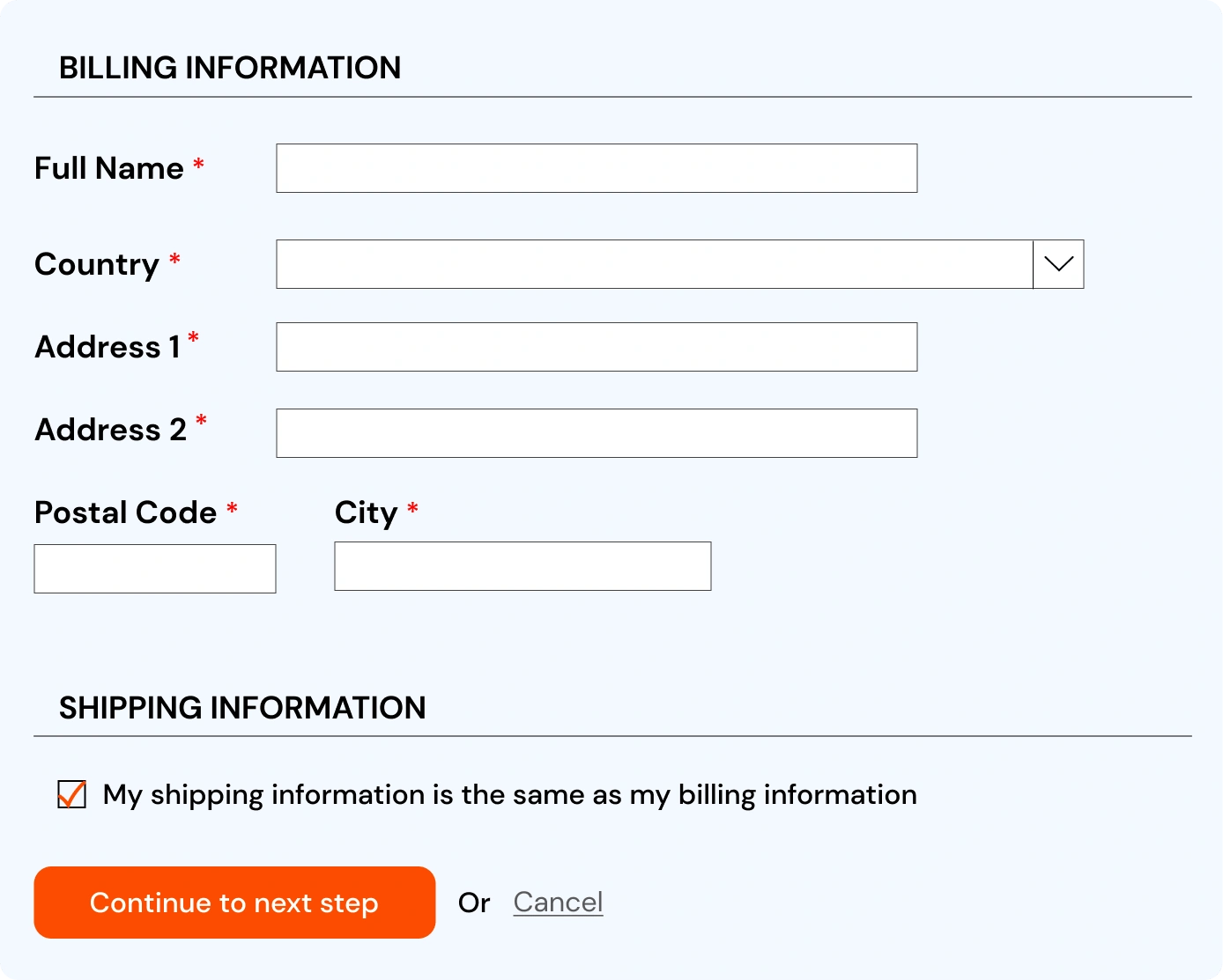
The Redundant Entry WCAG principle is understandable and has a conformance level of A. It focuses on the problem of how some forms require the user to input the same information more than once, for example, a shipping and billing address.
Real-Time Examples
- On an e-commerce website, a form allows the user to check that the billing and shipping addresses are the same.
- A search results page pre-fills the search input with the previously submitted search word.
- A form requests the user's corporate identification number (ID) to purchase a new computer. In the 3rd step, the user authenticates the laptop belonging to the user and re-shows the ID. It allows the end user to alter the ID but defaults to the most recently entered information.
Success Criteria
Allows users to confirm that the billing and shipping addresses are the same.
Benefits
Users with cognitive disorders often have trouble with short-term and working memory. Not requiring to memorize exact information over and over again minimizes stress, the risk of errors, and the likelihood of mistakes for them.
It also enables users who experience difficulty forming new memories, recalling information, and other cognitive functions to complete processes without relying on their memory. Users with mobility impairments who prefer using switch control or voice input also benefit from a reduced need for text entry.
Target Size (Minimum)
This WCAG principle is operable and has an AA conformance level. It focuses on the target size for pointer inputs, which should be a minimum of 24 by 24 CSS pixels in size. However, there are three exceptions to the pointer-target size success criteria, including:
- There is a user interface component like a button to change sizes and spacing to meet the minimum.
- The webmaster places the target inline in a sentence.
- The required spacing for information conveyed isn't a minimum target size.
Real-Time Examples
- Websites with multiple buttons should have buttons large enough for users to click or activate. This should be done without accidentally clicking on any other nearby element on the web page.
- To help users with hand tremors and difficulty with fine motor movement to click on intended elements, such as buttons.
Success Criteria
It includes leaving proper spacing between targets.
Benefits
This principle benefits:
- People access gadgets with one hand and interact primarily via a touch screen on a mobile device.
- People using a mouse, stylus, or touch input with mobility impairments such as hand tremors.
- Mouse users who have difficulty with fine motor movements, people with large fingers, or who are operating the device with only a part of their finger or knuckle.
What's Next: WCAG 3.0
W3C released WCAG on 6 September 2022. But there are already speculations and interest in WCAG 3.0, which will have:
- Flexible conformance levels
- An increase in the number of standards, broader scope, and focus on users
- The scope will cover desktop apps, mobile apps, authoring tools, user agents, web applications, IoT devices like wearables, virtual and augmented reality, assistive technologies, and operating systems.
- The draft guidelines will also include text alternatives, clear words, captions, structured content, visual contrast of text, and error prevention.
The experts at Axelerant use WCAG 2.2 guidelines to ensure the highest accessibility compliance. Read more to find out how.

Annam Sreenivasan, Business Analyst
A zealous personality, Ann loves to travel and is obsessed with dancing. She believes in inspiring her team to do the impossible by not letting fear get in the way. Once away from work, she likes to organize her home space, read books, or watch regional films.
 We respect your privacy. Your information is safe.

Leave us a comment