A Reimagined UX and Content Architecture to Improve User Engagement
The official website of the Office of the High Commissioner for Human Rights is the world’s most trusted source of information and documentation on human rights. Prior to the platform relaunch, this information on human rights was being published across three different websites:
- OHCHR.org
- Human Rights Council Website
- Stand Up 4 Human Rights (Campaign Website)
To create a more consistent brand and navigation experience, digital leaders at OHCHR determined it was time to consolidate the platform.
Also, OHCHR.org was hosted on SharePoint, which called for a decentralized CMS with defined user roles. The UI and taxonomy also needed an overhaul in order to improve usability for browsers and mobile and accessibility for the visually impaired.
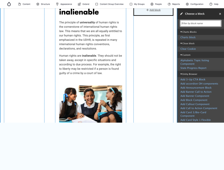
The solution was a reimagined Drupal 9 website with an impactful UX design and an information architecture that transforms the entire site experience, its security, and content integrity.
About the Customer
The Office of the High Commissioner for Human Rights (UN Human Rights) is the leading UN entity on human rights. The organization embodies the commitment to the promotion and protection of the full range of human rights and freedoms set out in the Universal Declaration of Human Rights.
Their official website, OHCHR.org, is a trusted source of information on human rights for a large user base, including academics, law professionals, NGO and NHRI professionals, politicians, government officers, journalists, and the like.
- #1
Source of Information on Human Rights
- 06
Official UN Languages
- 15
Member Nations
The (ongoing) journey of transforming things around for OHCHR.org has been a long one full of learning. The very fruition has filled us with a sense of excitement and fulfillment for us.
- Team Axelerant

The Challenge
There were two core challenges that needed to be resolved:
- Poor Navigation & Visual Hierarchy
The poor navigation and visual hierarchy of the website and landing pages made content navigation a challenge for contributors and end-users. The content was tagged with an ever-expanding hierarchy with no streamlined process.
- Centralized Publishing
The system lacked decentralized publishing capabilities. Content publishing and management in six official UN languages—English, French, Spanish, Arabic, Russian, and Chinese—were challenging due to a lack of templates and content components. A large number of volunteers were using the same account to publish. This made content management complicated.

The Solution
A better CMS and a reimagined UX and information architecture became the holistic solution.
With our trusted partner agencies and OHCHR, we began a transformative journey that would last 21 months.
- Blue State reimagined the user experience design.
- Dovecot reinvented the taxonomy.
The idea was to meticulously plan the redesign, development, and migration of the website.
Based on Blue State’s and Dovecot’s groundwork in UX design and information architecture, our team of Business Analysts, Technical Architects, and Drupal & Frontend Developers carried out thorough technical discovery for 6 weeks.
Project Summary:
- Rearrange the information architecture
- Redesign the website
- Migrate the website to Drupal 9 for a complete experience

The Result
The end result is a completely transformed OHCHR.org website and an incredibly flexible, ownable design system that presents an organization at the forefront of promoting and protecting human rights.
The website is user-focused, secure, and multilingual—one with great user experience and intuitive content navigation.
A Secure User-Focused Website
Once migrated from SharePoint to Drupal 9, the website became a secure platform that offered ease of use to both the sets of users—content publishers and readers. User roles, content management, and the look of the site became simple yet effective.
An Indicative & Engaging Platform
When it comes to such a high global authority as the OHCHR, it was imperative that their digital assets come with a great experience. The new website with improved UI, UX, and subsites, makes sure that OHCHR is represented well.
A Site with Smooth Navigation
An easy-to-navigate information architecture makes the new OHCHR website a great experience. The tiered site map and logical taxonomy ensured that the content is easily discoverable no matter what the user needs to look up.
Project Highlights
-
Discovery
-
Technology Implementation
-
System Integrations
-
Content Design
-
UX Design
-
Hosting
-
Training Support
Discovery
Extensive joint discovery sessions ensured we had a shared understanding of the requirements to start designing and implementing the solution with Drupal.
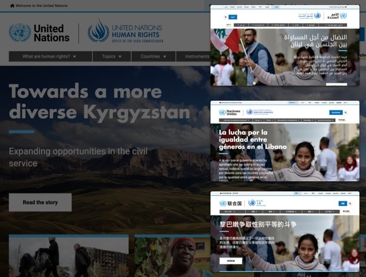
Together with Blue State, we participated in detailed sessions on content strategy, information architecture, and taxonomy. Six weeks of discovery sessions were held to understand content complexities. This discovery became the foundation for the migration strategy, the technical requirements, and integrations, followed by feature prioritization.

Technology Implementation
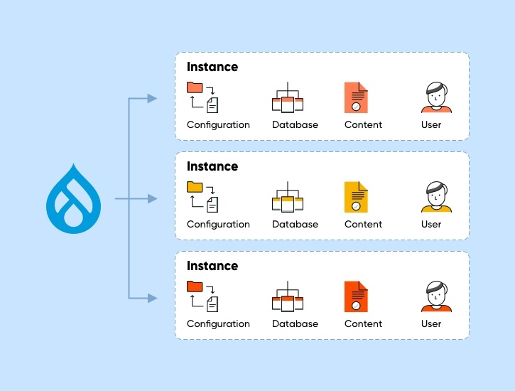
Our team of technical architects and engineers built a multilingual Drupal-based platform for OHCHR.org, including a United Nations Human Rights Council subsite.
The foundation was a component-based design system. We also integrated the platform with the UN Human Rights documents database and hosted it at the United Nations International Computing Center (ICC).
Besides this, we helped with the campaign generation website, Stand Up For Human Rights, as part of the overall platform.
System Integrations
To achieve the desired results, we integrated the site with multiple databases which host various official UN Human Rights documents:
- For taxonomy, hosting physical files
- For retrieving the files from the UN's Official Document System (ODS)
- For taxonomy and feeding content dynamically from other systems
Content Design
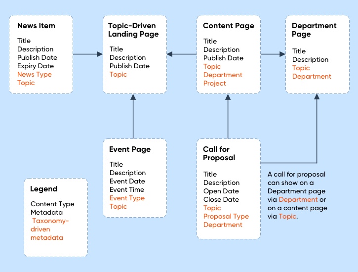
In a prior phase to prepare for this project, OHCHR partnered with Dovecot Studio to restructure the taxonomy, guided by an updated content strategy.
They were able to design and implement a multilingual taxonomy that enabled better discoverability and site engagement.
UX Design
Our experienced agency partner, Blue State, reimagined the site’s UX and UI to express OHCHR’s story, mission, and impact powerfully.
We aimed to ensure the technical feasibility of a component-based design system.

Hosting
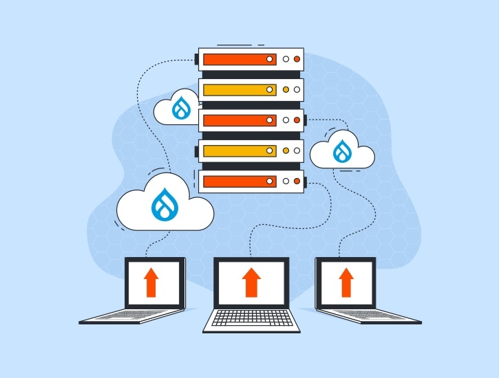
We hosted the new Drupal-based OHCHR.org website on the United Nations International Computing Center (ICC).
It took close collaboration with the ICC team to define the hosting infrastructure for Drupal-based production environments that are secure & scalable for the OHCHR’s requirements.
Training Support
Since a decentralized CMS was a new system for the OHCHR team, training was needed.
Right from admin manuals to training, we enabled team OHCHR to manage the entire content authoring process on their own in a decentralized manner.
A Success Story that Stands out
The project was a great learning opportunity for team Axelerant, given the time spent and objectives achieved. OHCHR.org stands out as the prime example of optimizing the haystack and a perfect case of complex website migration to Drupal 8/9 and leveraging taxonomy to make content more accessible. Together with our agency partners from Blue State and Dovecot Studio, we presented the success story at the DrupalCon Europe 2021.
Get in touch.
Send us a message and connect with one of our brand consultants to find out exactly how we can help you.