Optimizing UI, UX, Editorial Experience, and Performance for Doctors Without Borders’ Website
Doctors Without Borders (Médecins Sans Frontières, MSF) operates in over 70 countries, delivering emergency medical care in some of the world’s most challenging environments. While the organization’s fieldwork embodied urgency, compassion, and action, its digital ecosystem lagged behind — fragmented across regions, inconsistent in experience, and disconnected from the data that could power meaningful engagement.
The mission was clear: to reimagine MSF’s global digital experience and unify its web, mobile, and data infrastructure into a single connected ecosystem that could inspire empathy, drive donations, and strengthen supporter relationships across the world.
About the Customer
Doctors Without Borders, an international, independent medical humanitarian organization was established in 1971 in Paris by a group of 300 journalists and doctors. Today, they are a global movement of more than 63,000 people from more than 160 countries.
Their US office staff of 231 people supports the association’s services through staff recruitment, fundraising, communications, awareness campaigns, and advocacy.
The organization includes health professionals, logistic and administrative professionals who are bound by a common charter. This charter spells out the terms of assistance, neutrality, impartiality, risks and dangers of the mission, and the compensation by the association.
They’ve been instrumental in saving lives the world over during wars and conflicts, big and small.
- 12.6
Million Outpatient Consultations
- 1M
Patients Admitted
- 72
Countries

The Challenge
MSF’s existing digital presence struggled to keep up with its scale of operations and storytelling ambitions.
- Fragmented web ecosystem: Dozens of regional websites operated on disparate platforms with inconsistent design and content standards.
- Disconnected data: Supporter and donor information was siloed across systems, preventing personalized communication or unified reporting.
- Manual content workflows: Non-technical staff found it difficult to update or localize critical field stories in real time.
- Limited personalization: Campaigns relied on one-size-fits-all messaging, reducing emotional resonance and conversion potential.
- Performance gaps: Sites struggled with accessibility, load times, and mobile responsiveness — especially in bandwidth-limited regions.
The objective was to create a digital and data-driven foundation that unified storytelling, improved operational agility, and enabled personalized engagement at scale.

The Solution
Axelerant led the global digital transformation initiative for MSF — bringing together journey mapping, design strategy, content rearchitecture, web and mobile engineering, and CDP implementation into a single orchestrated solution.
The transformation was driven by one guiding idea:
Humanitarian storytelling should feel as immediate and personal as the work itself.
User Journey Mapping — From Awareness to Action
Our process began with understanding the diverse journeys within MSF’s audience landscape: individual donors, corporate partners, volunteers, field professionals, journalists, and advocates.
Workshops and stakeholder sessions revealed critical emotional and functional pathways:
- Donors: Needed clarity on how their contribution creates impact, and reassurance through transparent storytelling.
- Volunteers and Field Staff: Needed quick access to opportunities, application workflows, and internal updates.
- Supporters and Advocates: Wanted immersive stories, updates, and direct ways to take part in global campaigns.
- Press and Partners: Required structured access to verified assets and crisis updates.
These journeys helped define the content architecture, navigation flow, and activation triggers for engagement and personalization — establishing clear transitions from awareness to empathy, and empathy to action.
Design Strategy — Empathy by Design
The visual and experiential direction focused on Humanitarian Clarity — a digital expression of MSF’s values: transparency, urgency, and compassion.
- Emotion through simplicity: Stripped-back layouts placed authentic photography and field reporting at the forefront.
- Calm interaction design: Subtle, fast transitions — ensuring continuity even in high-traffic or emergency updates.
- Accessibility as a design core: Interfaces built to WCAG 2.1 AA compliance with optimal readability, contrast, and adaptive behaviors.
- Mobile-first focus: Every component designed to function across low-bandwidth conditions, reflecting the realities of MSF’s global footprint.
- Unified global design system: Tokenized components allowed regional flexibility while preserving MSF’s brand discipline.
The design system turned the platform into a living narrative — one that could respond in real time to global events and tell stories that moved people to act.
Content Strategy — Building a System for Real-Time Storytelling
MSF’s greatest asset is its voice from the field. We redefined the content strategy to connect that voice with the world — faster, clearer, and with greater impact.
- Modular storytelling: Created flexible content templates for field updates, crisis reports, and personal stories that could be assembled quickly without design intervention.
- Global taxonomy and metadata: Unified how stories, regions, and emergencies were tagged, enabling cross-region discoverability and campaign clustering.
- Localized publishing workflows: Empowered regional teams to publish in local languages while maintaining brand and message integrity.
- Embedded calls-to-action: Donation prompts and subscription entry points were integrated contextually within stories, rather than as interruptions.
- SEO and visibility optimization: Structured metadata and schema markup boosted organic visibility by more than 40% post-launch.
The new content model turned every article, campaign, and update into an activation opportunity — a living entry point to participation.
Web and Mobile Platform Build — Designed for Global Agility
Axelerant engineered a Drupal-based multi-site architecture that brought all global and regional MSF entities under a shared technical and design framework.
Key capabilities included:
- Unified infrastructure: One core platform with decentralized permissions for regional content teams.
- Component library: Atomic design principles applied for reusability and speed in launching new campaign sites.
- Performance optimization: Adaptive image delivery, caching, and CDN integration reduced global load times to under 2.5 seconds.
- Scalability and resilience: Cloud-native hosting architecture ensured 99.9% uptime even during high-traffic emergencies.
- Mobile app enablement: APIs prepared for integration with the MSF mobile ecosystem — enabling push updates and offline accessibility for field workers and volunteers.
- Governance and security: Role-based access, automated updates, and audit logs met MSF’s stringent data privacy and compliance needs.
The result was a global platform engineered for speed, reliability, and emotional precision — equally effective for a donor in London or a field volunteer in Sudan.
CDP Implementation — Turning Data into Empathy
Alongside the experience transformation, Axelerant implemented a Customer Data Platform (CDP) to unify supporter data across all digital touchpoints — website, email, donations, and campaigns — creating a single source of truth for personalization and activation.
CDP Strategy and Execution:
- Unified Data Model: Merged data streams from donation systems, marketing automation tools, CRM, and analytics into a centralized CDP.
- Real-Time Segmentation: Enabled segmentation based on donor behavior, giving patterns, engagement recency, and preferred causes.
- Personalized Campaign Activation: Integrated the CDP with marketing platforms to deliver targeted campaigns — e.g., resurfacing field updates from regions donors had supported before.
- Journey Orchestration: Defined behavioral triggers that moved users seamlessly from awareness (reading a story) to action (donating or subscribing).
- Analytics and Reporting: Built dashboards to track donor lifetime value, engagement trends, and conversion performance by region.
This transformed how MSF connected with supporters — shifting from one-way communication to real-time, data-informed empathy. Each engagement — whether an email, social ad, or in-site message — now reflected individual interest, history, and impact.

The Result
The digital and data transformation fundamentally reshaped how Doctors Without Borders communicates, inspires, and activates support globally.
Key impacts:
- Significant increase in donor conversions driven by integrated storytelling and data-personalized campaigns.
- Faster publishing workflows across global and regional teams.
- Improvemed site performance and accessibility metrics.
- Unified global brand presence across 70+ country sites.
- Deeper audience insight through centralized data — enabling continuous optimization and more relevant supporter journeys.
Beyond metrics, the new platform allowed MSF to speak with one authentic, compassionate voice — agile in emergencies, unified in purpose, and deeply human in tone.
Project Highlights
-
Customized Solutioning & Management
-
Well-Timed Launch
-
Continuous Support & Maintenance
-
Revamped Editorial Experience
-
Upgrade to Drupal 9
Customized Solutioning & Management
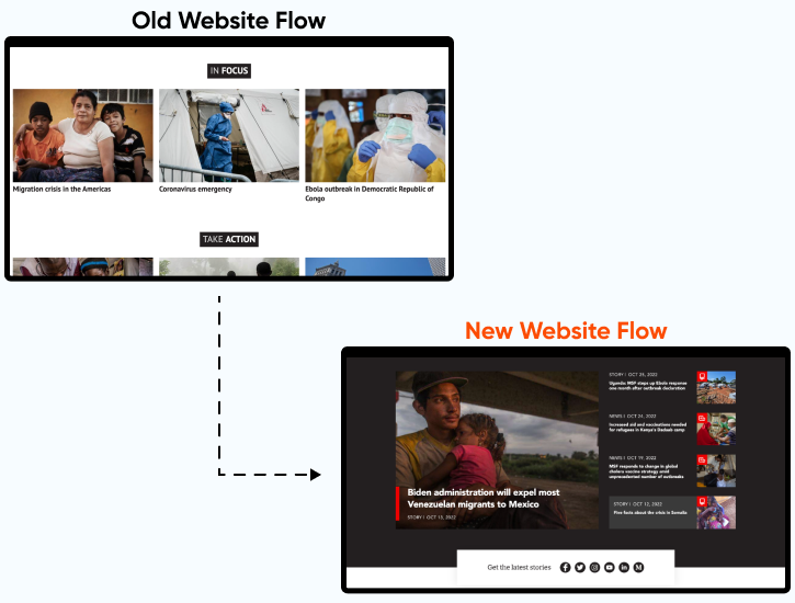
Together with Doctors Without Borders , we decided to take an incremental design approach with focus on building strategy and creatives with the client and we kept track of the backlog.
To improve the frontend as well as the backend experience, teams from Doctors Without Borders and Axelerant collaborated extensively across time zones.
We also proactively proposed solutions to keep the development team working at full efficiency even when Doctors Without Borders was less available to participate.
This approach helped ensure that the UX and UI update was on schedule.
Well-Timed Launch
As we approached the launch, the Russia-Ukraine conflict began. This required rapid response from Doctors Without Borders. Doctors Without Borders were confident that we could launch and boost the donation response to the crisis right away.
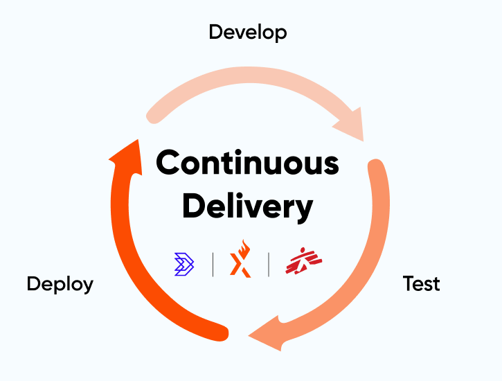
The reason was the trust in our continuous delivery process. It ensures that the gaps, if any, are bridged along the way before we’re ready to launch.
This is why Axelerant and Doctors Without Borders were sure of the stability of the build and the benefits that were to come if we launched the website.
And so, together, we made the call to move forward with the launch. The impact of this decision was huge.
Continuous Support & Maintenance
To achieve the desired results, we integrated the site with multiple databases which host various official UN Human Rights documents:
- For taxonomy, hosting physical files
- For retrieving the files from the UN's Official Document System (ODS)
- For taxonomy and feeding content dynamically from other systems
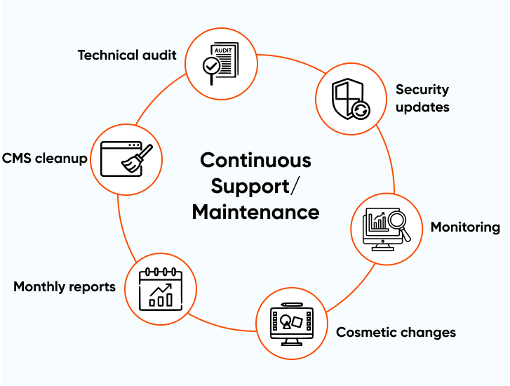
There were some enhancements requested to the design which were slated for the second phase, for a timely release to raise funds for Ukraine.
We are planning to start the second phase which will be focused on remaining features, outstanding issues, CMS cleanup, and technical audit items.
Revamped Editorial Experience
We introduced new components in the CMS to provide more options for editors to add interactive elements that engage end-users:
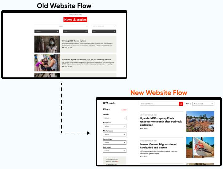
- Transformed template and design for each content type to make it modern and intuitive
- New responsive templates, even for non-standard resolutions, so that the site looks and functions well on any device
- A host of new user-friendly pages like the “News & Stories” page and “Events Listing” page which had a rudimentary design in the old website
- Removal of old fields for better clarity for editors.
- A comprehensive guide for content editors to help train them to make the best use of the CMS
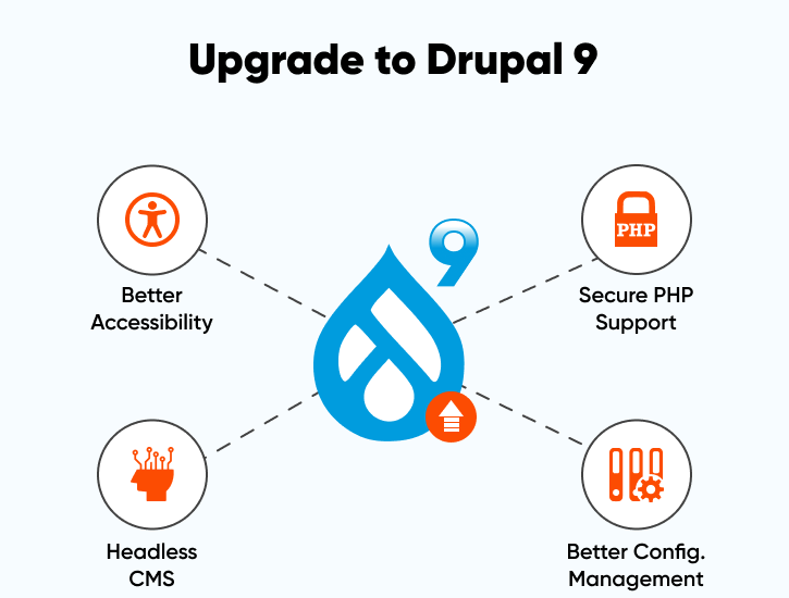
Upgrade to Drupal 9
The next crucial milestone for Doctors Without Borders was a Drupal 9 upgrade. The platform had been created during the early days of Drupal 8. The repository went as far back as 2018. A lot has changed in five years, for e.g., deprecated contrib modules, compatibility of the custom code with PHP 8, deprecated third-party components (Solr Search API), and so on.
We started working on upgrading the website from D8 to the latest version of D9, along with the PHP 8 upgrade. We launched successfully in May 2023. This launch was expected and proved to be crucial in terms of security and overall project performance.
Creating a Deeper Impact Together
Having contributed to aid Ukraine during the crisis, there is more that Doctors Without Borders intends to achieve. We’re working on creating complex backend features that will allow Doctors Without Borders to make a deeper impact via their platform. Some of the most anticipated features they’re looking to launch are UX enhancement of the event listing page and a brand new story feature.
Get in touch.
Send us a message and connect with one of our brand consultants to find out exactly how we can help you.