We will be looking at how to test Advanced Elements on Frontend
1. Carousel
- Verify that the user can move to the next and previous slides by clicking on the arrow/slider/indicator in the carousel. Refer to Figure 1, for example.
- Supposedly we have an auto-rotate feature:
- Verify whether images/videos auto-rotate after a specific interval of time.
- If the carousel has videos in it, and the user plays the videos, verify that the carousel does not auto-rotate to the next image/video when the video is in progress.
- Verify when the video is finished after playing in the carousel, the carousel auto-rotate feature resumes.
- If stated in the requirement, there may not be any indicators on the carousel, and the carousel would auto-rotate. Refer to Figure 3, for example.
- Verify the images and videos uploaded of the preferred size and are displayed correctly in the carousel.
- Verify the smoothness of loading the carousel and images/videos in the carousel.
- If stated in the requirement, verify the auto-forwarding/ auto-rotate pauses on the mouse-hover.
- Verify the height and width of the container in the carousel.
- Verify the navigation controls are highlighted when the images/videos are changed in the carousel. Refer to Figure 2, for example.
- If stated in the requirement, Verify if thumbnails exist in the carousel, then on click of the thumbnails, the images/videos are expanded and played. Refer to Figure 4 for examples.

Figure 1: Carousel with Navigation Controls

Figure 2: Carousel without Control

Figure 3: Carousel with Indicators
(Image Source for Figure 1, 2, and 3)
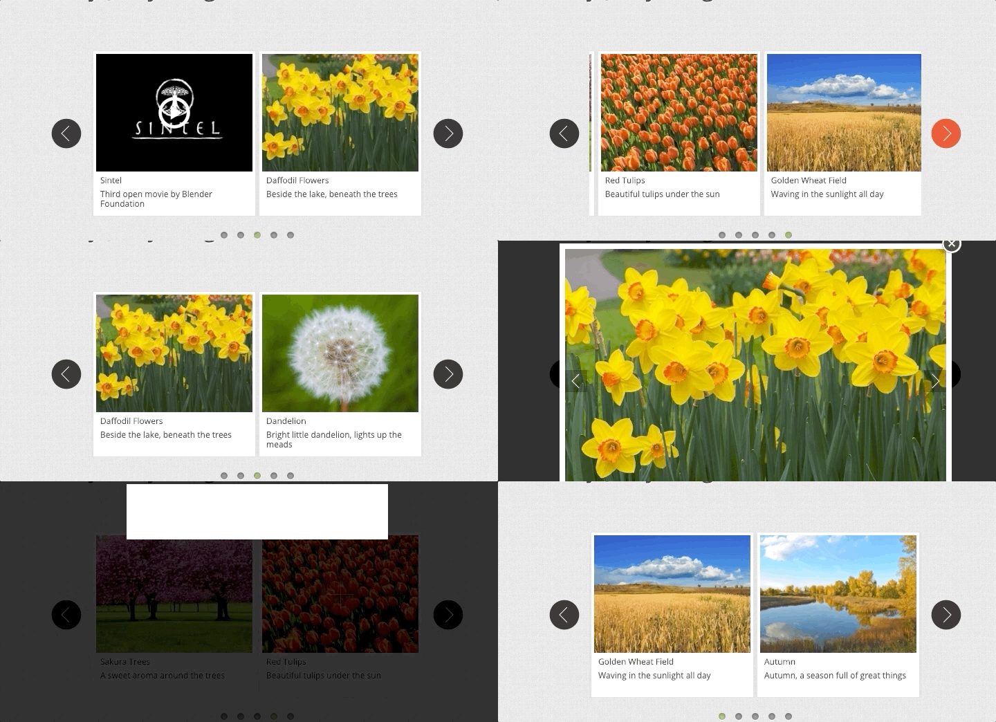
Figure 4: Carousel with Thumbnails. (Image Source)
2. Cards
- Verify Cards can have varying heights to accommodate different types/amounts of content but should have a fixed width from one card to another.
- Verify layout and outline for the cards.
- Verify cards are themed as per the website theme.
- Verify behavior for mouse-hover on a card. It should get highlighted, and the mouse icon should be changed to a hand icon (or as per the requirement).
- Verify components that a card comprises of, e.g., text, image, CTA, etc.
- Verify the font color, size, family, background color (Already mentioned in FE Checklist Basic Elements Blog) for elements in the card.
- Verify cards have consistent spacing and padding between each other when we have multiple cards.
Please refer to Figure 5, for example.
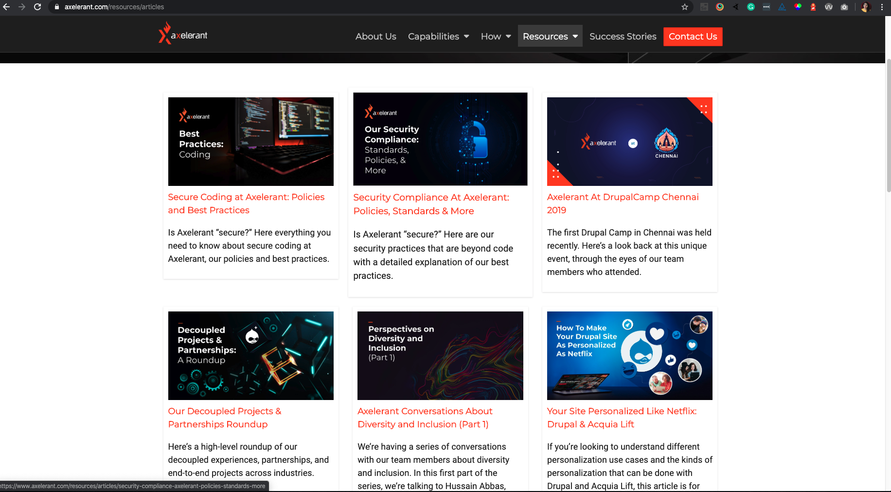
Figure 5: Cards
3. Accordion
- Verify an accordion always contains the category title, an expanded and a collapsed state, an icon indicating expansion, and the spacing between them.
- Verify accordion expands the content of the section, when we click on it.
- Verify the default collapse and expand behavior for the accordion.
- Verify the icons of the accordion when they are expanded and collapsed.
- Verify accordion is themed according to the website designs.
- Verify the labels, font color, font size, font family, and background color on the accordion. (Already mentioned in FE Checklist Basic Elements Blog)
- Verify the accordion toggles correct for its section.
- Verify if there are multiple accordions on a page. If we expand one of the accordions, the other accordions close automatically or stay expanded (If stated in the requirement).
- Verify there is no flickering of data inside the accordion when the accordion is expanded.
Refer to the example in Figure 6
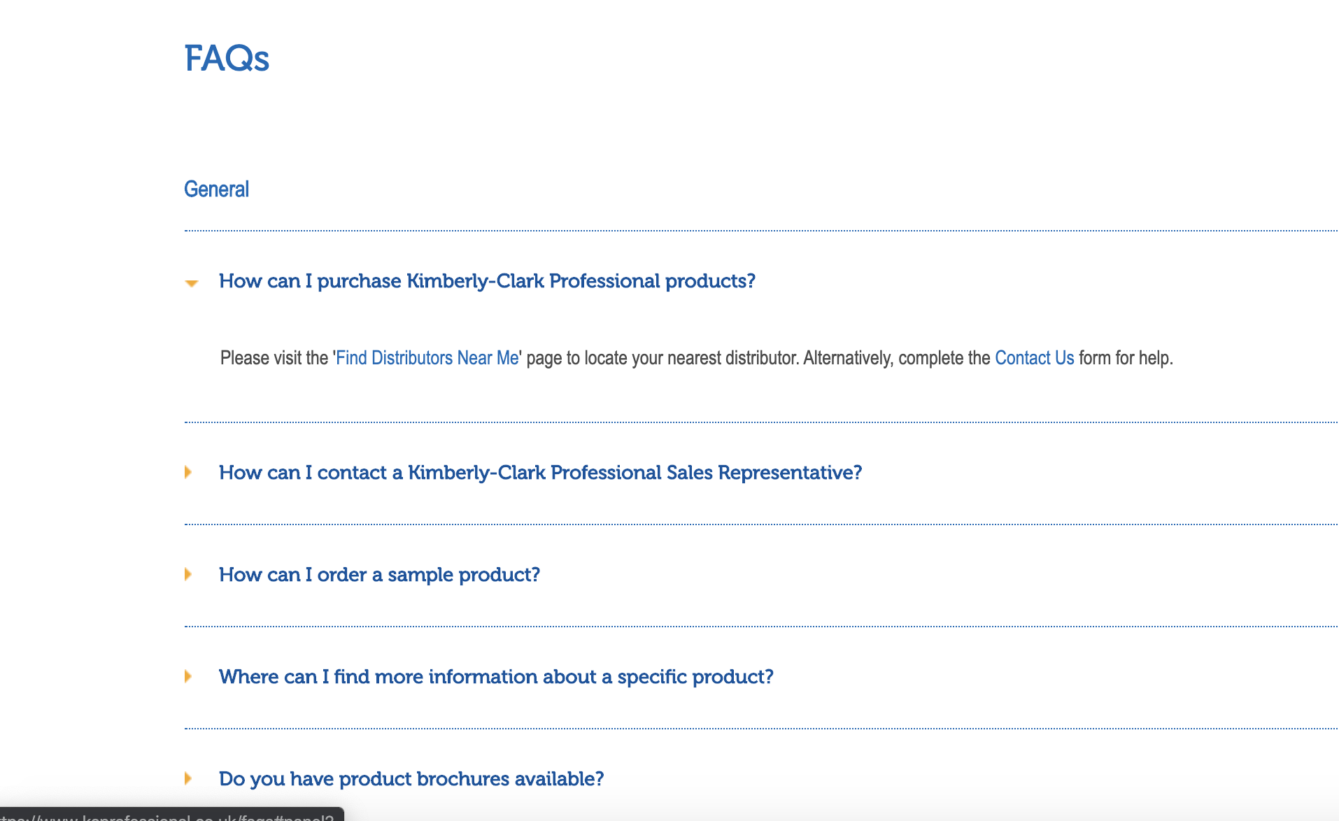
Figure 6. Accordion (Image Source)
4. Grid
- Verify the layout of the grid.
- Verify the consistent spacing and padding of rows and columns in the grid.
- Verify the placement of the modules inside a grid, i.e., sizes of images/text/videos, etc. placed in the grid (if applicable) are auto-adjusted as per the size of the grid.
- Verify the alignment of the modules inside the grid.
- Verify the items placed inside the grid should not overlap each other, and text should wrap instead of overlapping.
Refer to Figure 7,8,9 and 10 for Examples.

Figure 7: Grid with the same size of images

Figure 8: Grid with different size of images Stretched

Figure 9: Grid with center alignment for all the images
(Image Source for Figures 7, 8, and 9)
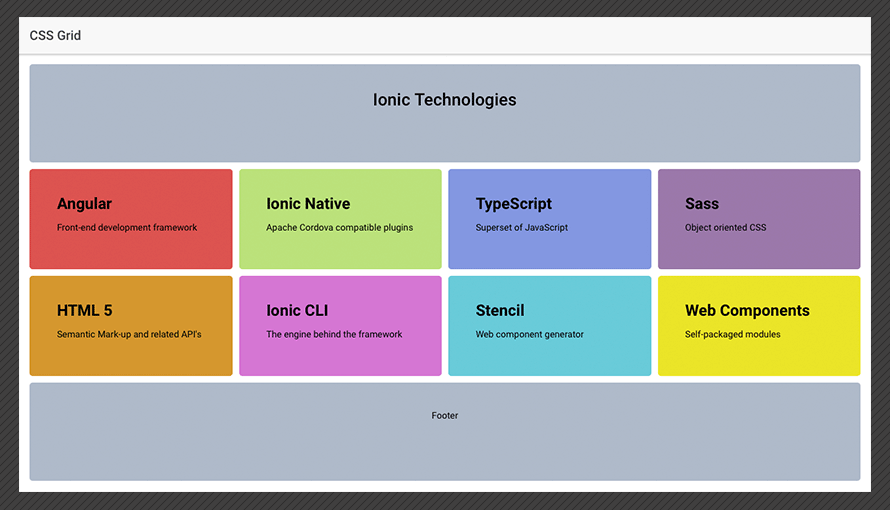
Figure 10: Grid with text (Image Source)
5. Modal
- If stated in the requirement, Verify when Modal Popup opens, the background screen is disabled, and the user should not be able to perform any action on the background window.
- Verify the user should be able to close the modal with a close button or Esc key (if modal is optional).
- If stated in the requirement, Verify, if the user input is mandatory, then the user should not have any option to close the modal without inputting the data.
- Verify the basic GUI testing scenarios for the elements in the modal such as Heading, fields, CTA, Font, spacing, padding, styling, colors, etc. (Already mentioned in FE Checklist Basic Elements Blog).
- Verify the Scroll bar should be available on the modal if needed.
- Verify the sizing and the location of the modal on the page; it should be too big or too small and should not take up the whole screen view.
- Verify Modal is themed according to the website design.
- Verify that tab via keyboard works fine on modal when it is opened, and focus does not switch to the background screen until the modal is closed.
Refer to the examples in Figures 11, 12, and 13.
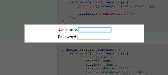
Figure 11: Modal Blocking the UI (Mandatory User Input)
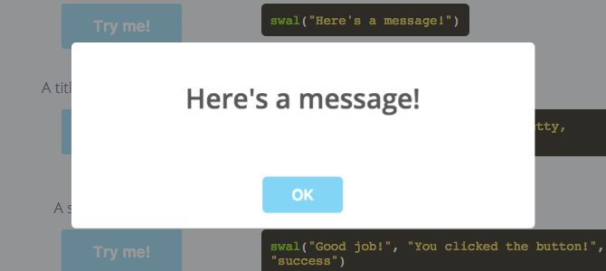
Figure 12: Alert Modal
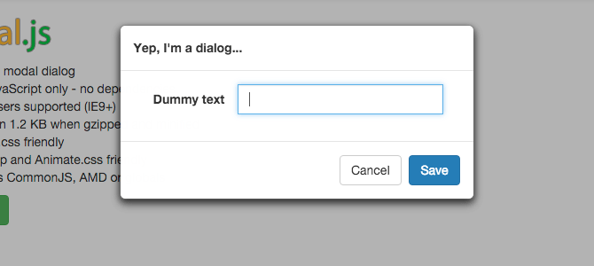
Figure 13: Modal having user input with the option to save and Cancel Buttons
(Image Source for Figures 11, 12 and 13)
6. LightBox
- Verify on click of the thumbnail, the image/video is displayed in the lightbox by filling the screen and dimming out the rest of the page.
- Verify the height and width of the container of the lightbox.
- Verify the UI of all the elements on the lightbox such as Zoom, expand and collapse, close icon, etc.
- If stated in the requirement, Verify the expanded image/video closes on click of the ESC key from the keyboard
- Verifying the tab order from the keyboard works fine in the lightbox.
- If stated in the requirement, Verify-in case, we have a gallery of images in a lightbox, users should be able to navigate via carousel or navigation keys to the next and previous image.
Refer to Figures 14 and 15, for example.

Figure 14a. Two individual images set of images
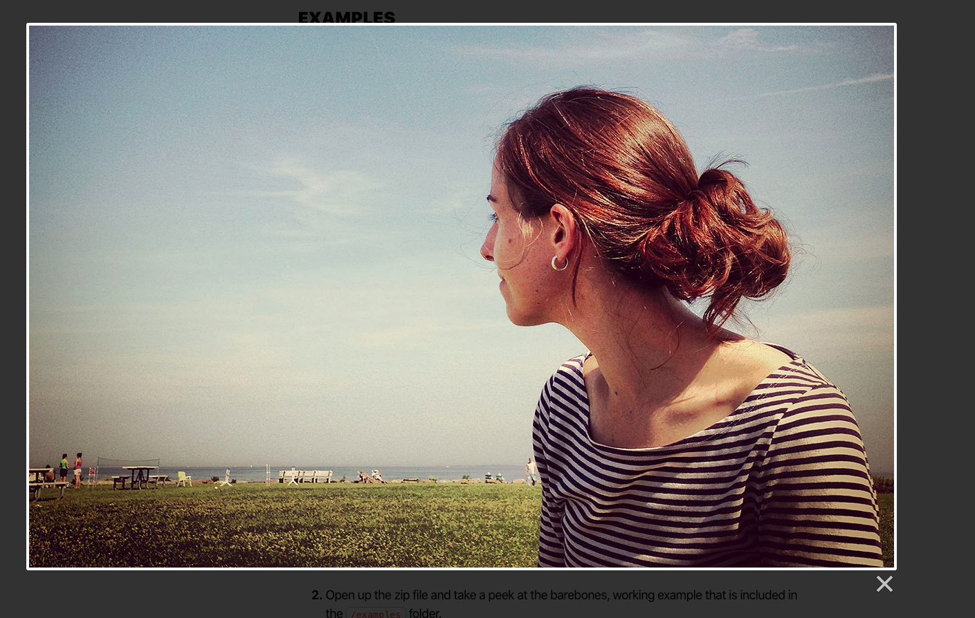
Figure 14b. The first image expanded in lightbox

Figure 15a. Four sets of images
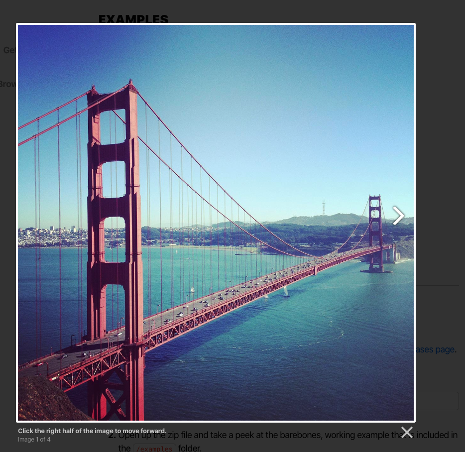
Figure 15b. First Image expanded in lightbox
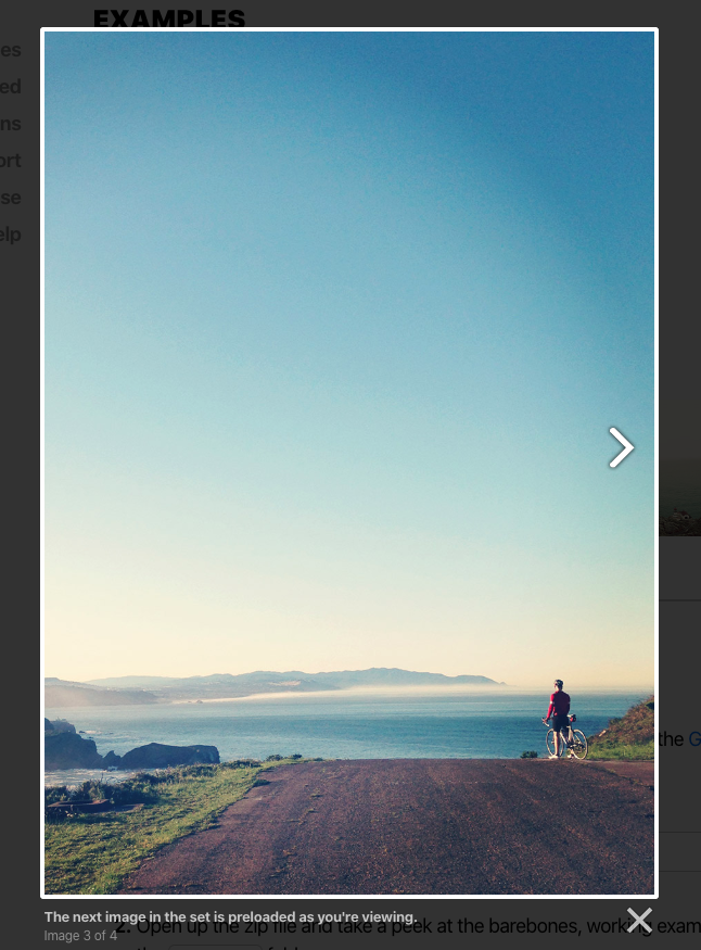
Figure 15c. The third image in a lightbox
(Image Source for Figures 14a, 14b, 15a, 15b, and 15c)
7. Menu
- Verify contents on the menu are appropriately aligned and are not congested or overlapping.
- Verify the position and alignment of the mega menu, good to have a menu to be centrally aligned.
- If stated in the requirement, Verify on click or hover the menu expands.
- Verify the basic GUI testing scenarios for the elements in the menu bar, such as field, CTA, Font color, size, family, spacing, padding, styling, hover effect, etc. (Already mentioned in FE Checklist Basic Elements Blog).
- If stated in the requirement, Verify the currently selected item is highlighted correctly and is visible.
- If stated in the requirement, Verify the mega-menu should be closed when we move out of the focus of the menu.
- If stated in the requirement, Verify the hamburger menu closes when we click on 3 line icon of the hamburger menu.
- If stated in the requirement, Verify the hamburger menu closes when clicked outside on the website apart from the menu item bar.
- If stated in the requirement, Verify the hamburger menu toggles, if there are multiple menus on the screen, one menu should close once another menu opens.
Refer to the examples in Figures 16 and 17.
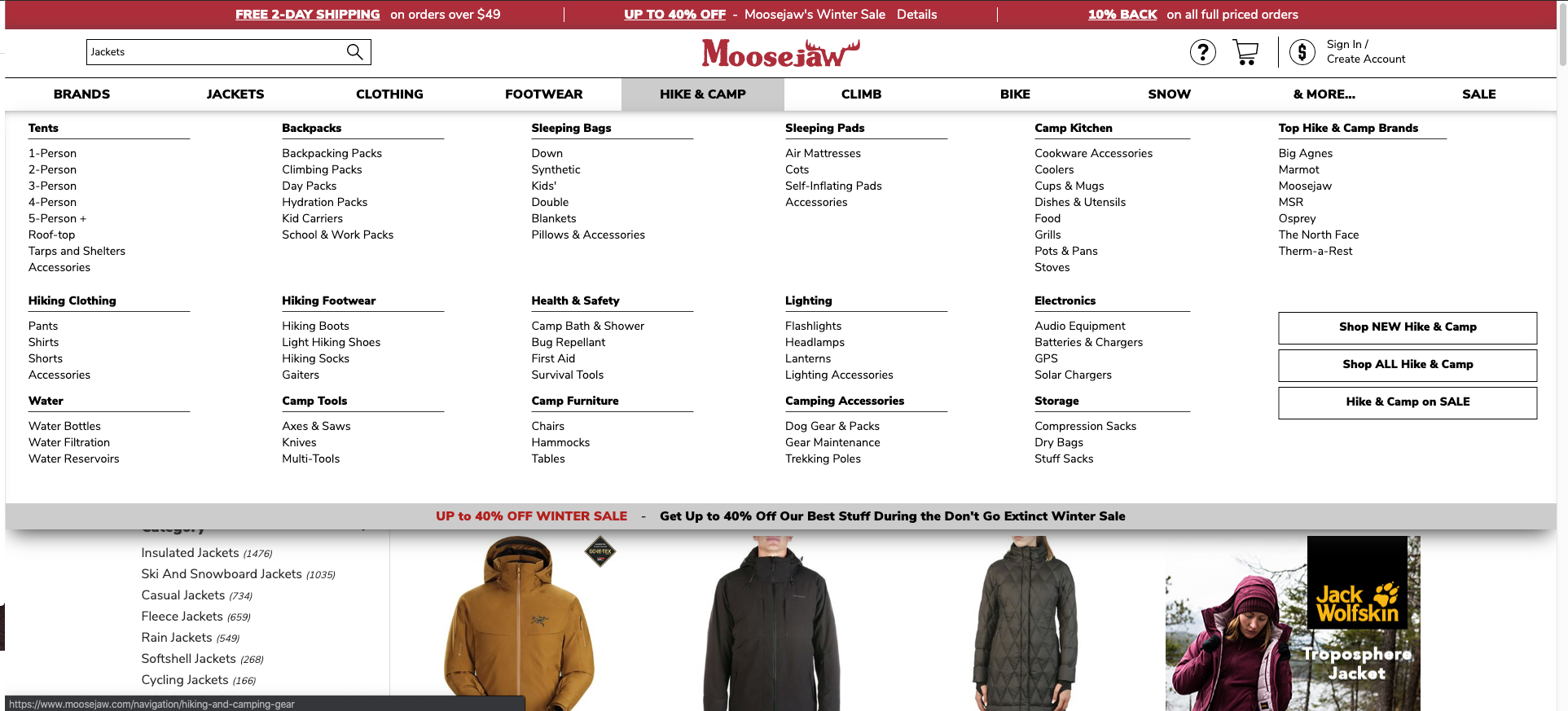
Figure 16: Mega Menu (Image Source)
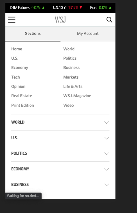
Figure 17: Hamburger Menu (Image Source)
8. Date and Time Picker
- If stated in the requirement, Verify if the date and time field has mandatory asterisk signs by default.
- Verify the date and time format in the date and time picker.
- Verify the selected dates are visually marked in the calendar.
- If stated in the requirement, Verify that the calendar visually marks today’s date.
- Verify the design of the error message when the displayed data is not correct.
- Verify users should be able to traverse within the calendar by back and next buttons.
- If stated in the Requirement, Verify the date picker is enabled and disabled.
- Verify calendar loads properly when we select any date.
- Verify the default height and width of the calendar when opened.
- Verify when the user selects the date and click on it, the same date is correctly visible in the text field.
Refer to the examples in Figure 18.
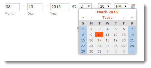
Figure 18: Date and time selector (Image Source)
9. BreadCrumbs
- If stated in the requirement, Verify breadcrumbs are themed as per the website theming.
- If stated in the requirement, Verify links in the breadcrumbs menu are separated using a symbol (>), and the menu items or (> ) symbol does not overlap. Also, there should be proper spacing between the links.
- Verify the current location of the page is highlighted on the breadcrumbs.
- Verify the position of the breadcrumbs, good to have it on the top of the page for better visibility and user experience.
- Verify the basic GUI testing scenarios for the links in the breadcrumbs such as font color, size, family, styling, background colors, etc. (Already mentioned in detail in FE Checklist - Part 1 Blog).
- If stated in the requirement, Verify the tooltips displayed on hover of the breadcrumbs menu.
Refer to the example in Figure 19.
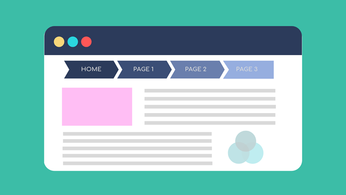
Figure 19: BreadCrumbs
10. Autocomplete/Auto Suggest Search
- Verify the placeholder displayed in the textbox in the autocomplete feature.
- Verify textbox is editable.
- Verify the spacing and padding of the elements displayed in the search results.
- Verify when selected a search result via auto-complete, the item should be highlighted in a different color.
- Verify the search icon in the autocomplete text box.
- Verify the font color, size, family, background color (Already mentioned in Checklist Part 1).
- Verify the hand icon of the mouse when hovered over the search results.
Refer to the example in Figure 20.
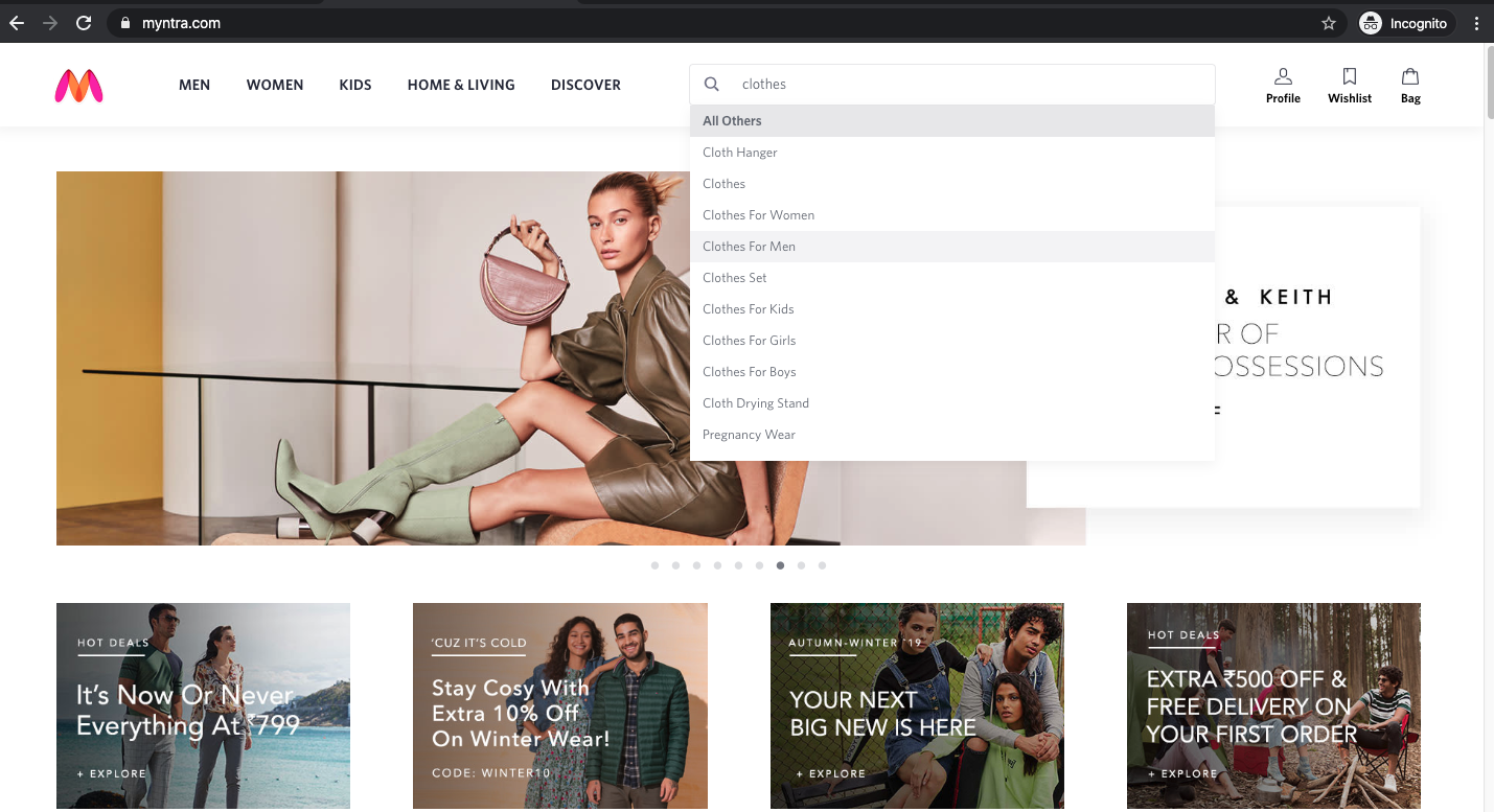
Figure 20: AutoComplete (Image Source)
11. File Upload
- Verify the label `Upload` is correctly aligned with the Upload button.
- Verify Upload window is opened once user click on the upload button.
- Verify the layout of the upload popup.
- Verify the UI of error messages displayed when users upload invalid file types, exceed the size limit, mandatory fields blank.
- Verify UI Of success messages when a user adds a valid file type. Messages should also be themed similar to the website theme.
- Verify the UI of Upload Window, which has multiple elements like:
- headings
- labels
- text boxes
- buttons
- close button
- help text
- tooltip
- font family
- font size
- the font color
- background-color, etc. (Refer to FE- Checklist Part 1 for details).
- Verify the UI of the loader icon/Progress bar displayed when the upload is in progress.
- Verify the height and width of the entire Upload popup.
- Verify the popup is themed as per the website, and the layout of the popup is correct.
- Verify the spacing and padding of the popup and elements inside the popup (Refer to FE- Checklist Part 1 for details).
- Verify-in case of multiple messages displayed they should not overlap each other.
- Verify the scroll bar in the popup (if applicable).
- Verify the formatting and layout of help text on the upload popup.
- Verify the asterisk sign for the mandatory fields.
Refer to Figures 21, 22, and 23, for example.
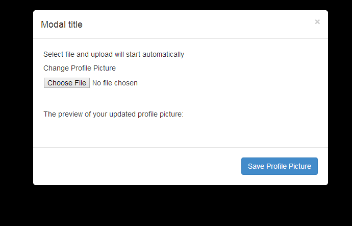
Figure 21: Upload popup Example (Image Source)
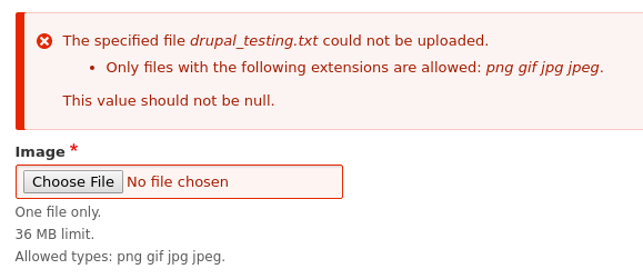
Figure 22: Error messages and help text on upload popup (Image Source)
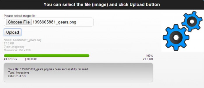
Figure 23: Progress bar while uploading the image in image popup (Image Source)

Shefali Arya, QA Engineer - L2
International culinary enthusiast with wanderlust—and by wanderlust she means she wants to see the whole world.
 We respect your privacy. Your information is safe.


Leave us a comment