Introduction
There are few organizations that write tests for their requirements, fewer ones who execute all of them after designing, even fewer ones capturing the test execution results and then the fewest who derive meaningful metrics and reports looking at the test execution results. In this blog, I will introduce you to the Testing Dashboard that we use in our Axelerant managed projects to track various testing-related activities.
Let’s directly sneak peek into the Dashboard items and understand the usage.
Testing Dashboard
A. Filter Results: Testing the progress of stories by Test execution issues
- This filter lets you understand the testing progress of individual stories.
- You can further filter it to display stories only for the current sprint, Fix version.

In this above image:
- The Links column is the story ID.
- The key column is the Test execution ID.
- The summary column is the summary of the Test execution.
- Test Execution status represents the overall status of all the tests in the test execution issue type associated with the story.
NOTE: This can be implemented only on Jira Server because the custom field Test execution status is not available.
B. Requirements List: Epics with failed tests
- The gadget (Image below) helps with quickly viewing all issue types mapped as requirements that are failing. It is grouped by Epic, so expanding the Epic displays the stories related to the Epic.
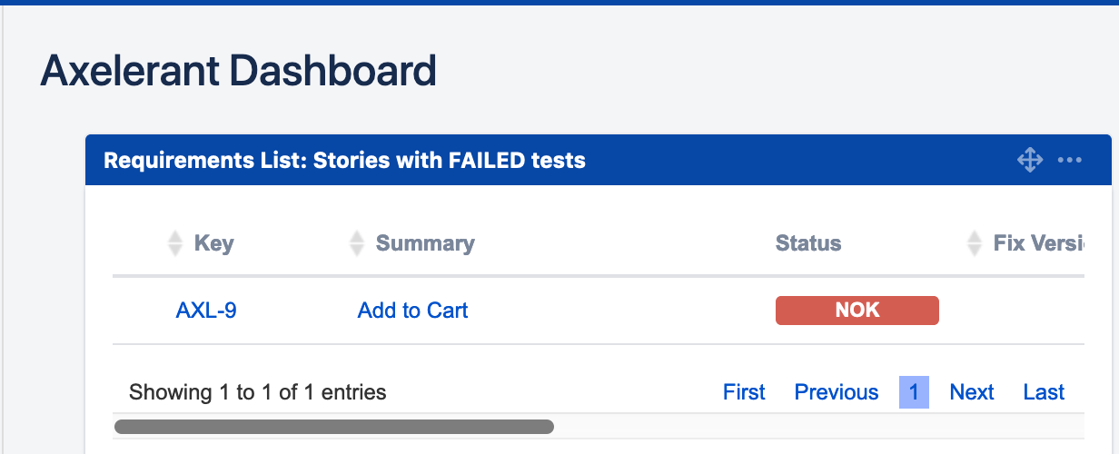
Axelerant Dashboard displaying all issue types mapped as requirements
2. You can further filter it to display stories only for the current sprint, grouped by the Fix version.
3. It also displays the test related statistics per Story like the Total number of tests, passed tests, failed tests, and others.
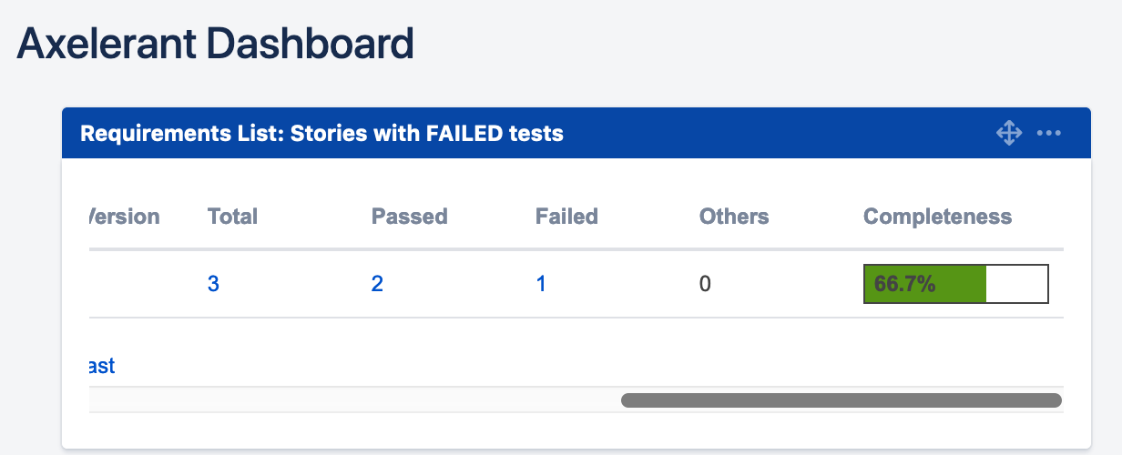
Axelerant Dashboard displaying the test related statistics per story
4. This gadget can similarly be used to extract stories/epics/tasks that are passing, test execution is in progress, and so on.
C. Pie Chart: Workload distribution of Test execution
- It is extremely important to understand the workload distribution between all the QA team members.
- The pie chart gadget filtered by all test execution issue types and grouped by Assignee gives you a quick overview of how the work is distributed in terms of percentage.
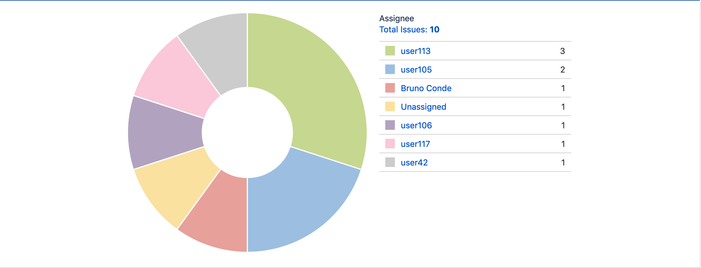
The pie chart gives a quick overview of how the work is distributed in terms of percentage
D. Overall Requirement Coverage
- This gadget gives an overview of the test coverage for all the requirements (Epic, Story, Task, Sub-task) in the project.
- This can be grouped by either Priority, Status, Resolution, or Component.
- If you follow the practice of grouping your features into components and then adding them to your requirements captured in Jira, then this can be useful in terms of understanding the testing coverage at the component level.
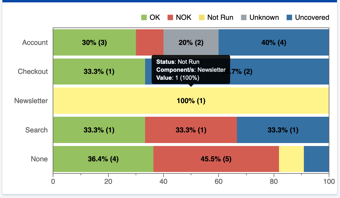
Graphical representation of testing coverage at the component level
4. If you do not use components at all, then grouping by priority makes more sense.
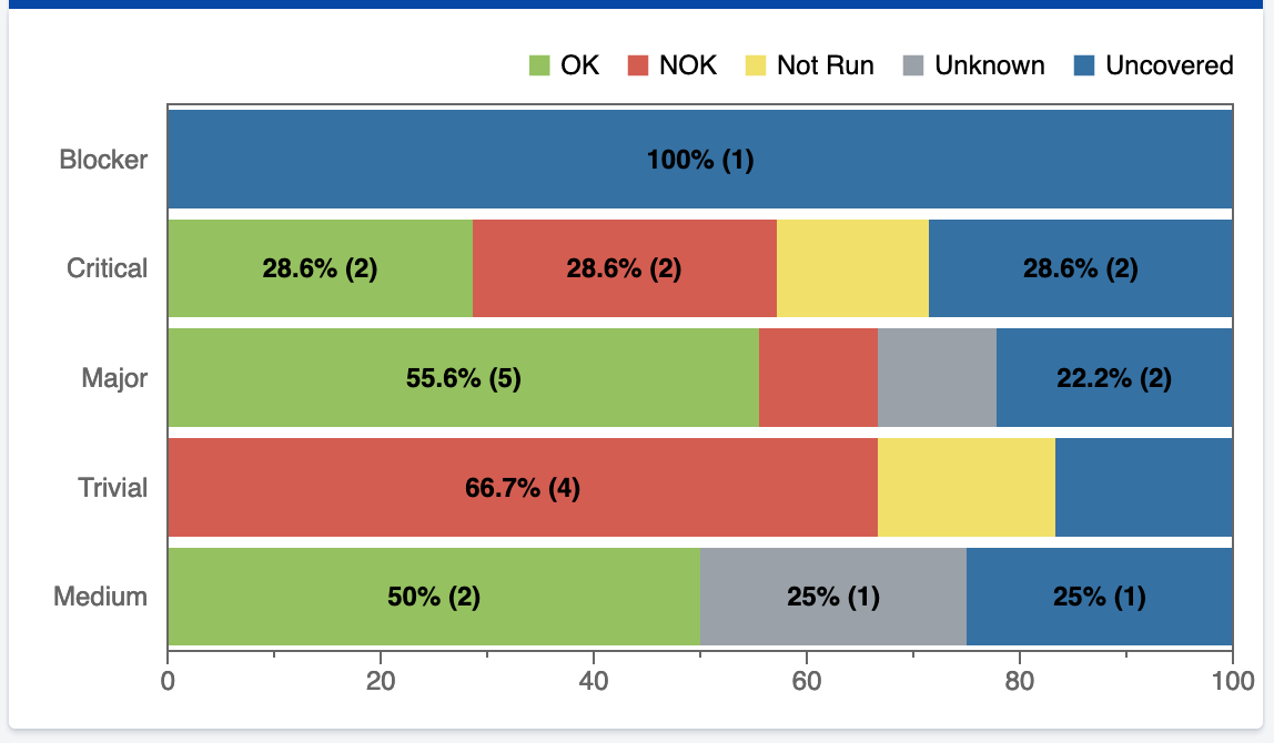
Graphical representation of grouping by priority
5. If you want to view the requirements coverage only for the parent items, then uncheck/disable “Flat Requirements Presentation” or else enable it to view the requirements coverage for all sub-requirements too.
E. Overall Test Results
- This gadget represents the Test run status of all the tests. It gives you an overview of the number of tests that are passing, failing, and so on.
- It can be represented by a pie chart or a table. (Images below)
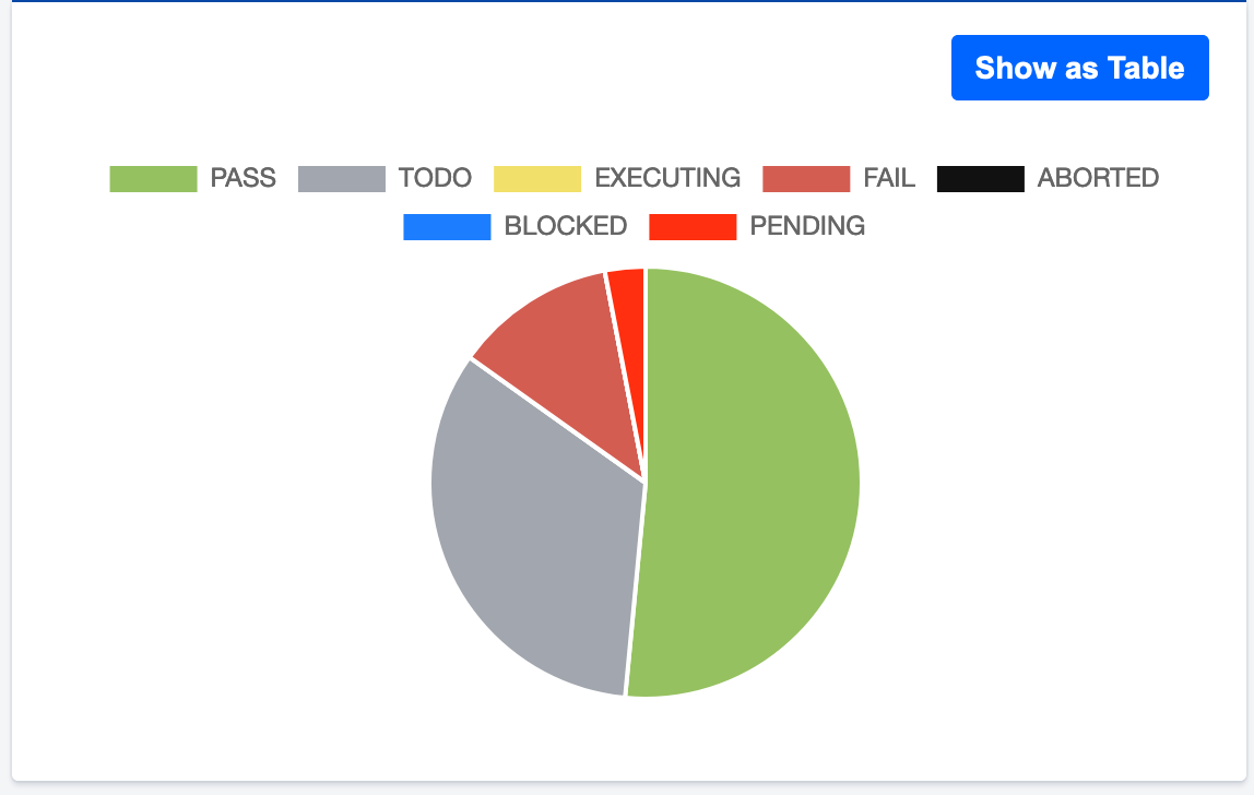
Test run status of all the tests represented via a pie chart
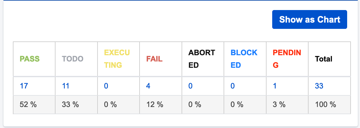
The above table represents the test run status of all the tests
F. Test Runs Summary
This gadget can be utilized in several ways. Let’s see them one by one:
- See the test run summary for all tests - When the gadget is grouped by key, one can understand the trend and test run history for each test. This gives us a good picture of the regressions that were introduced in the system.
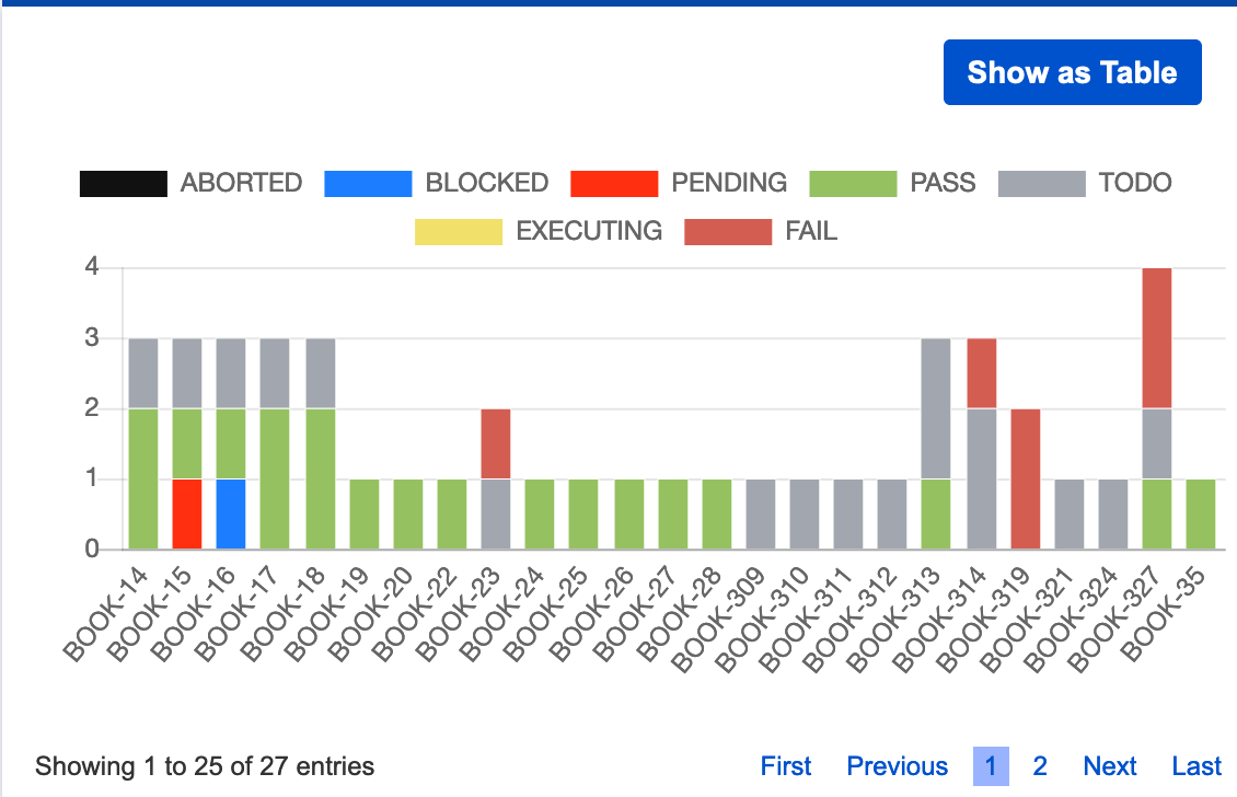
The above graph represents the test run summary for all tests
- See only the failed tests - When the gadget is grouped by key and filtered by TestRun Status as FAIL, it gives a good picture of the tests that have failed and the frequency of the failed test. This helps us to understand the most vulnerable parts of the system.
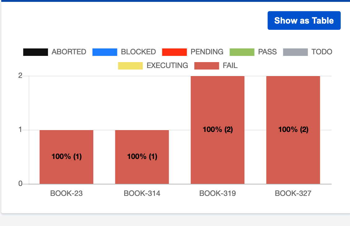
The above graph represents only the failed tests
- See the test run summary for components - When the gadget is grouped by component, then it lets you know the TestRun summary for each component. It lets you know and analyzes the most stable parts of the system and which component needs more work.
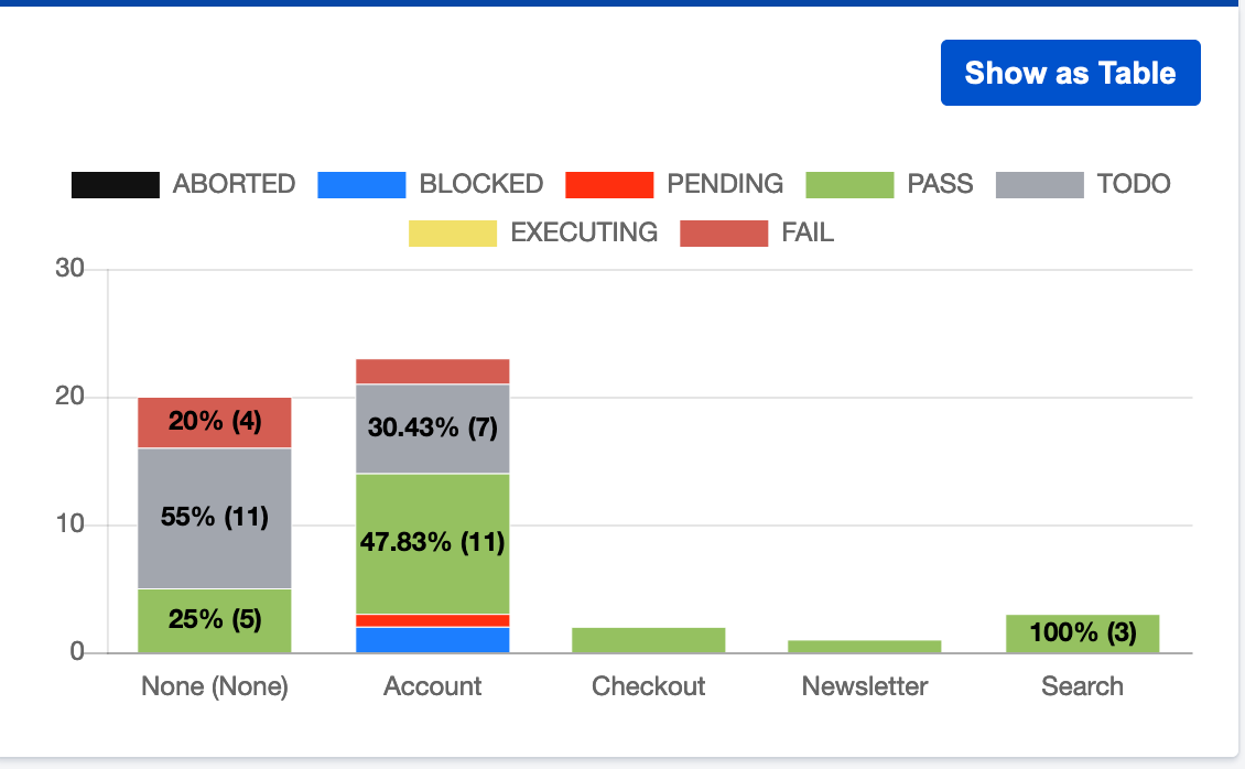
The above graph represents the test run summary for components
- Similarly, you can further group this gadget as Executed, Test Type, Environment, and Browser version to derive useful information.
The testing dashboard is something that can further be shared with the entire team so that the team also benefits from it and everyone is kept updated about the overall testing progress of the project. Apart from this, Xray also provides some built-in reports that can be used to analyze the project in various ways. These built-in reports in combination with the testing dashboard have helped our teams understand the current status of the project and take proactive steps whenever necessary.

Shweta Sharma, Director of Quality Engineering Services
When Shweta isn't at work, she's either on a family road trip across the country or she's dancing with her kids—it's a great combination.
 We respect your privacy. Your information is safe.

Leave us a comment