 We respect your privacy. Your information is safe.
Introduction to Accessibility
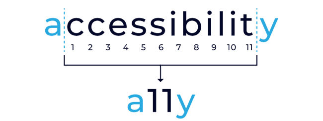
Accessibility is the quality of being easily understood and appreciated. It involves making things accessible to all people (whether they have an impairment or not) through the design of products, devices, services or environments. Accessibility can be viewed as the "ability to access" and benefit from some system or entity. It is also known as A11Y where the number 11 refers to the number of letters omitted from the word Accessibility.
What is web accessibility?
On the other hand, web accessibility ensures that websites on the World Wide Web are accessible easily without any barriers that prevent interaction for people with diverse abilities.
When sites are designed, developed and edited correctly, all users would have equal access to information and functionality. However, currently many sites and tools are developed with accessibility barriers that make them difficult or impossible for some people to use.
The web is fundamentally designed to work for all people, no matter what their hardware, software, language, culture, location of physical or ability.
Why test for accessibility?
It is essential to test all applications for accessibility to improve the customer experience. Developers and organizations are increasingly making sure to create high-quality websites and web tools, and not exclude people from using their products and services.
Importance of accessibility
- Improves maintainability and efficiency
- Increase market share and audience reach
- Aids usability
- Easy and efficient access to users with impairment and challenges
- Assists in access for low-bandwidth users
- Better and more maintainable code
- Good SEO (Search Engine Optimization)
- Maintains customer loyalty and brand value
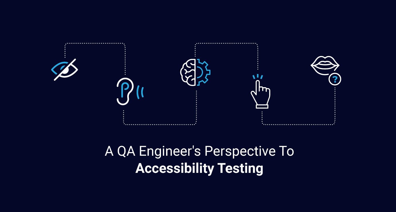
Different types of impairment and Accessibility techniques
The different types of impairment are mentioned below:
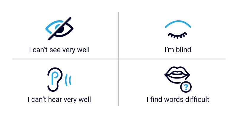
- Visual: Complete blindness or color blindness or poor eyesight, visual problems like refractive errors and blurry visions
- Physical: Difficulty using a keyboard or mouse
- Cognitive: Learning difficulties or poor memory
- Literacy: Reading problems, finding words difficult
- Hearing: Auditory problems like deafness and hearing impairments, difficulty hearing well or hearing clearly
The techniques which help users to access web content include:
- Screen Reader
- WAT (web accessibility toolbar)
- Screen Magnifier
- Bluetooth keyboards
- Speech recognition tools
About WCAG 2.0 and 2.1 standards
The Web Content Accessibility Guidelines (WCAG) standards, also called W3C recommendations, are stable, referenceable standards that do not change.
It defines how to make content more accessible for people with impairments. Accessibility involves a wide range of impairments which can include physical, visual, auditory, speech, cognitive, language, learning and neurological impairments.
The four guiding principles of accessibility in WCAG 2.0:
| Perceivable | Operable | Understandable | Robust |
Below is the list of similarities and differences between the two standards WCAG (2.0/2.1).
|
WCAG 2.0
|
WCAG 2.1
|
QA checklist for Accessibility testing
- Desktop/mobile online tools
- Testing using keyboard navigation
- Testing using screen reader
- Testing using color contrast tools
1. Assistive online tools for accessibility testing
Let's talk about the online tools which are available to test desktop/mobile applications, along with a manual examination to verify any web page for accessibility.
Desktop online tools are:
| Online tools | Description | Browser Compatibility | References |
| WAT (Web accessibility toolbar) | WAT is specific to the IE browser and can be helpful for a web page evaluation compliance to the web content accessibility. | Extension for IE and Opera browser | WAT accessibility toolbar for IE |
| WAVE (Web accessibility evaluation tool) | It allows users to inject icons and indicators into a web page, which provides feedback visually for the accessibility of web content. |
Browser extensions for Chrome and Firefox. |
Chrome: WAVE Chrome Extension at the Google Web Store |
| Deque tools: AXE Plugin | Axe is an open source, fast, light-weight accessibility testing tool. It only tests the web page components that actually present on the site or the application you are testing. |
It works for all modern |
For more information, refer to this link: |
| FireEyes Plugin | The free browser-based tool FireEyes, by Deque, allows you to analyze the accessibility of your web content in the DOM, after the browser has interpreted the code, and after JavaScript has been applied to the page. |
Only for Firefox browser. |
|
| Color Contrast Analyzer | This tool helps to determine the difference in the color and the brightness of the object in the same view field. It uses the graphical controls and visual indicators to find out the certainty of text and the visual elements contrast. |
Any browser |
Mobile online tools are:
| Online tools | Device | Description |
| Accessibility Scanner | Android app | This tool suggests improvements related to accessibility for Android apps without the need for any technical skills. Click the open link on the app which you want to scan; this will display the Accessibility scanner button. Tap it to find the elements that might benefit from accessibility improvements. |
| Accessibility Inspector | iOS app |
This testing tool is available only for Apple devices to check accessibility for iOS apps. It can be launched by clicking on Xcode, then clicking the Open button, and then clicking Developer tools. Users can see the option as “Accessibility Inspector” in the menu bar. |
| Mobile Web Accessibility Checker | Mobile web - Only for iOS device | This app is only available on the App Store for iOS devices. Users get a complete solution to verify mobile web accessibility by enabling it on devices and comparing to internationally recognized accessibility guidelines. |
Checklist for manual examination which must be referred to for any site:
- Alt text, title and heading text
- Visual focus indicators
- Script and timing control
- Client-side forms validation
- Indicating changes in language
- Multimedia captioning checks
2) Testing using keyboard navigation
The first step in manual testing is to throw away your mouse. Verify that the user is able to navigate the website page, including the header, footer, all menus and interactive elements using only the keyboard.
Testing using keyboard navigation
Validating keyboard accessibility: It is an important step to evaluate accessible interactions by using a keyboard.
Below is the complete checklist which one can follow on a variety of desktop/mobile devices while using external keyboards.
Keyboard focus:
- Ensure that the focus order on the site is impulsive, and that it follows the visual order of the web page.
- Ensure that all functionality is easy to use and available using only the keyboard.
- Ensure that the focus is never deceived in an element and it cannot be escaped by the keyboard alone.
- Ensure that visibility is there at all times to the keyboard focus area for all browsers/device, in a way that is accessible to users with low vision or color blindness.
- Ensure that whenever a user changes focus on the web page, there is no change of context.
- Ensure that the ARIA 1.1 Authoring Practices are followed for the interactions.
- Ensure that keyboard shortcuts are avoided. If at all they are implemented, they should not interfere with any browser shortcuts or other screen readers, and can be turned off.
- Ensure that keyboard focus is always visible and easy to recognize.
- Ensure focus order is set to be as meaningful as it can be, and is easy to use.
- Ensure that there isn’t a change in web content, software, viewport or an additional change in focus area when a user has initiated any change in the keyboard focus.
- Ensure that Skip navigation to Main Content link for the keyboard users should be at the top of the page for any site. This link might be hidden, but it should be visible when it receives focus via a keyboard.
Tab order:
- TAB through the page to see if the order is logical.
- See if you can activate all interactive elements with Enter and Space keys.
- Tab order should be logical. It should be left to right and top to bottom.
- All elements on the page can be reached by keyboard. This includes drop downs, menu items, buttons and other interactive elements.
- Users can select the menu items or drop down items with the keyboard.
Forms:
- Tab order of forms should be logical.
- If there is a drop down menu, users should be able to navigate and select items using keyboard alone.
- Data entered should be retained if the page is refreshed or too much time is taken to fill out the form fields.
- If a required field is left blank, keyboard focus should shift to that field when the user is notified.
- As soon as you submit the form and an error appears on the field, keyboard focus should be set on that field.
Dialog box and pop-ups:
- As soon as the dialog opens up, keyboard focus should be set on the dialog.
- Dialog can be dismissed using keyboard.
- When the dialog is closed, focus should be set on the element which activated the dialog on the parent page.
Multimedia Controls: For video, audio, and animated carousels.
- Manual control exists for play/pause.
- Controls can be tabbed through.
- Controls can be activated using the keyboard.
Skip Navigation Links:
- Skip navigation links get exposed on keyboard focus.
3) Testing using a screen reader
Below are the commonly used screen reader combinations with browsers:
- IE + JAWS
- Firefox + NVDA
- Safari + Voiceover
- Chrome + Talkback
Here’s the QA checklist for testing using a screen reader:
- Ensure that the page has a relevant page title. so that screen reader users know what page they are on.
- Ensure that images which are not decorative are read by the screen reader, and that they have relevant alt text.
- Ensure decorative images are not read by the screen reader.
- Ensure all the interactive elements (buttons, checkbox, links, radio button, edit box) are rendering the role. Example: button or link.
- Ensure that all interactive elements (buttons, checkboxes, links, radio buttons, edit boxes) have labels. Example: "Submit" for a Submit button/link.
- Ensure error fields have relevant error message.
- Ensure error messages are announced by the screen reader as soon as they appear on the page.
Testing using a Voice Over (screen reader) on Chrome
Links:
- Ensure ‘Links’ are descriptive without generic text such as "Click Here".
- Ensure that the role assigned to the "Link" on the site is announced by the screen reader.
Logical Headings:
- Headings should be logical to provide structure and indicate the importance of the content.
- Heading levels should not be skipped.
- There should be only one H1 on the page.
- Users should be able to navigate pages using headings.
Skip Navigation Links:
- Skip navigation links should be present and read by the screen reader.
- Skip links should work as intended with the screen reader, skipping to the main content of the page.
Images:
- Purely decorative images should have ALT="".
- All meaningful images should have descriptive alt text.
- All navigation image buttons should have descriptive alt text.
Multimedia:
- For video, audio, animated carousels.
- Multimedia controls should have alt text.
- Video or audio should not start automatically.
- Controls should be labeled properly.
Forms:
- Form fields should have descriptive labels.
- Appropriate descriptive labels should be present and read by the screen reader.
- Users should be able to fill out the form and submit it successfully.
- Buttons should be labeled and read correctly by the screen reader.
- Required/optional fields should be announced by the screen reader.
- Errors on the form field should be announced by the screen reader as soon as they appear.
Data Tables:
Data tables should have designated header and/or column rows.
- Tables should have captions.
- Tables should not be nested.
- Row and column headers should be associated with the appropriate scope attribute.
4) Testing color contrast/zoom
Testing using Color Contrast analyser tool
Testing using Wave tool
Here’s a QA checklist to verify the color contrast by using the color contrast analyzer to calculate the ratio per page.
- Ensure normal text has a color contrast ratio of 4.5:1.
- Ensure that large text has a color contrast ratio of 3:1.
Note:
- Normal Text: Text below 18 point normal or below 14 point bold
- Large Text: Text over 18 point normal or over 14 point bold
Other things which can be verified using color contrast analyzer are:
Choice of color:
- Color is not the sole means of conveying information on the page.
- Sufficient color contrast ratio for normal and large text as per WCAG 2.1 AA.
- Graphical user interface also passes for color contrast ratio of 3:1 as per WCAG 2.1 AA.
- Hover and underline have sufficient color contrast and underline.
Zoom:
- Text is the actual text and not image of text.
- Font size increases when you zoom into the page.
- Web page is responsive when scaled up to 400 percent.
- Items are not jumbled when zoomed into.
Usability:
- Fonts are basic and legible.
- There is plenty of white space.
- In case of touch, touch area should be 44 by 44 pixels.
- There is no flashing, blinking and moving text.
- Menus are consistent across the entire site.
- Visual navigation is logical.
Testing Non-audio:
- Users have control over play/pause of video or audio.
- All videos have captions.
References
Keyboard shortcuts for screen-readers:
Voice over: https://www.applevis.com/guides/macos-voiceover/complete-list-voiceover-keyboard-shortcuts-available-macos

Nikita Jain, Quality Assurance Staff Engineer
"Nikki" is a shopaholic with wanderlust, who loves Bollywood movies and good food; offline, you'll find her doting on her beautiful baby girl.


Leave us a comment