Introduction
A document is considered accessible when it can be read with the same ease by someone with vision, hearing, or cognitive impairment as by someone without any impairments. Ensuring accessibility is easiest during the initial stages of creating a document.
Read more to learn about document accessibility, how to test it, and what can be done to practice it.
Challenges Faced Due To Document Inaccessibility
To understand the importance of ensuring accessibility in documents, one must understand the challenges that can arise due to document inaccessibility.
Ambiguous Language
Many inaccessible documents are written in vague and ambiguous language that can be difficult to understand. This is specifically true for people with impairments related to reading.
Inadequate Formatting
Inaccessible documents often lack appropriate formatting and structure, such as proper headings, meaningful paragraphs, and a table of content. This makes it challenging to navigate the document while using a screen reader or other assistive technology.
Lack Of Alternative Formats
Many documents are only available in PDF format, which can be difficult to read by different types of assistive technology devices. This makes it impossible for individuals to access the content without specialized software or assistance from someone else.
Lack Of Awareness
Images within documents can present an accessibility challenge because they may not include alternative forms describing their contents. This means that users with assistive technology might never become aware of the existence of such documents!
Readability Issues
Documents with small fonts and low-contrast backgrounds might decrease readability for visually impaired users.
Working on document accessibility from the start can help eliminate these challenges.
Recommendations For Ensuring Document Accessibility
The basic steps for creating accessible documents are similar regardless of whether the document is in HTML, Microsoft Word, PDF, or other formats. These steps are:
- Ensure non-text content such as images and logos have alternative text or text descriptions to provide context.
- Include tagging structure that is accessible by assistive technology.
- Properly label form fields, so it's accessible to keyboard-only users.
- Ensure all links and interactive content are labeled and work when activated.
- Format tables properly and designate table headers.
- A text size of 12 points or higher will benefit most users.
- Numbers from one to nine are easier to read if written as words, while numbers from 10 upwards should be presented as numerals.
How To Ensure Accessibility For Different Document Types
There are different recommendations for ensuring accessibility for different document types. Learn more about these recommendations here.
Microsoft Office
Ensuring accessibility in a Microsoft Office document includes adequately labeling images, charts, and other non-text content. Documents should be formatted to maximize legibility and readability, including headings.
Documents should also be designed to be navigable using keyboard shortcuts. Accessibility testing for these documents can be done with tools like the Accessibility Checker in Microsoft Office.
Microsoft Word
Microsoft Word includes various accessibility features that help users access content quickly. One can access this option in the File menu under Options > Accessibility.
From there, users can turn on settings such as high contrast mode, which changes text and background colors to improve visibility. Zoom adjustments can also allow users to customize their view of documents. Microsoft also provides an extensive guide for creating accessible documents in Word, including instructions for adding alt-text descriptions to images.
Microsoft Excel
Accessibility issues in Microsoft Excel can start with the physical design of the program itself. Excel's menus and ribbons can be difficult to navigate by accessibility tools. This is why Microsoft Excel offers accessibility options such as High Contrast Mode, Adjustable Color Settings, Magnifier Tool, and Screen Reader Support.
These options make Microsoft Spreadsheets fully compatible with assistive technologies such as screen readers like JAWS and NVDA.
Microsoft PowerPoint
Microsoft Powerpoint comprises the following features, which have been explicitly designed to make the experience of creating and presenting PowerPoint presentations more effortless and inclusive.
Keyboard Shortcuts
Shortcuts can quickly navigate through a presentation, such as switching between slides. This makes it easier for those with difficulty using a traditional pointing device like a mouse.
Text-To-Speech Narration
Microsoft has built-in support for text-to-speech technology in PowerPoint. This allows users to access the content of their presentations easily by having them read out loud through an audio output like headphones or speakers.
Alt-Text
This feature allows users to add descriptive text for images and other objects in a presentation so that those who are visually impaired can still understand the content of slides.
Accessible Themes
Microsoft has provided several templates specifically designed with accessibility in mind. This makes navigating through their presentations easier for people using assistive technologies.
Google Drive Files
Google Drive provides a range of accessibility features like voice recognition, dictation, text-to-speech, closed captioning support, and high-contrast themes. Google Drive has also implemented the Accessibility Checker tool, which allows users to quickly identify potential accessibility issues in their documents before sharing them with others.
Apart from these inbuilt tools, testers can use add-ons such as Grackle, which is available for all formats like doc, slides, and sheets.

Google Docs
Google offers several accessibility features in Google Docs.
- Screen Reader Support: Use screen readers such as VoiceOver (iOS and Mac) and TalkBack (Android) to read aloud text on a device while browsing the web version of Drive.
- Speech Input: This feature allows users with motor impairments to access the same tools available through typing by speaking into the microphone built into the devices.
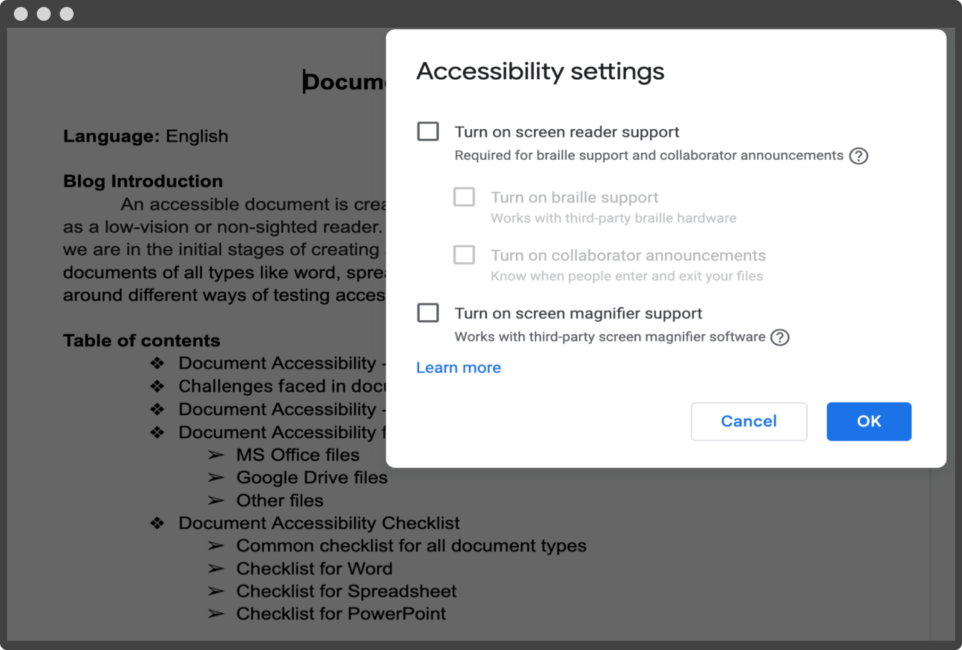
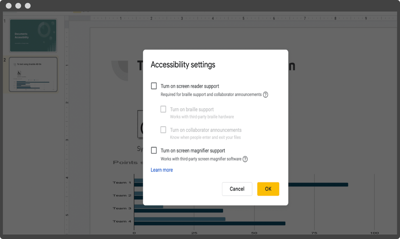
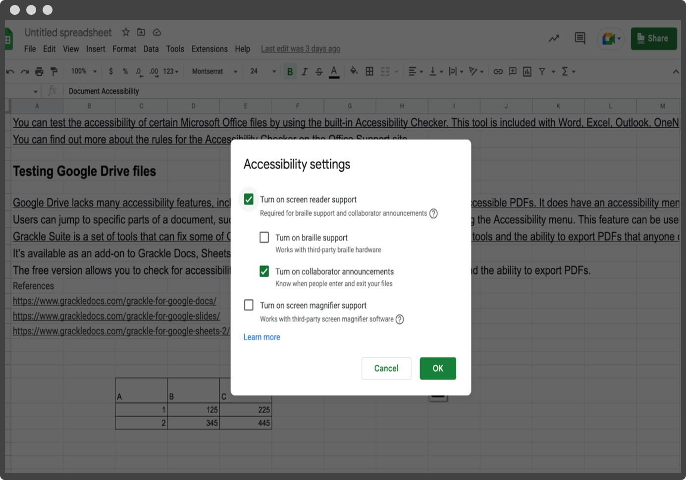
Assistive technologies can also use Google's inbuilt screen reader and magnifier support.
Google Slides
Google Slides increase accessibility by providing alternative text descriptions, or alt tags, on images used within the slides. Alt tags help with search engine optimization, which results in slides showing up higher in search results when relevant keywords are used.
Audio recordings also can be added directly to the slide decks. This is ideal if presenters want to speak aloud but are not physically present during delivery.

Apart from this, add-ons like Grackle can help in testing for the accessibility of the slides.
Google Sheets
There are several ways that one can make Google Sheets more accessible, including setting up the computer's display settings. Enabling zoom functions also allow better readability as one can magnify specific areas of text that may otherwise be too small to view comfortably on screen.

Several plugins allow users to customize how data appears inside sheets, like adding borders around individual cells or improving text line spacing. Grackle sheets are one plugin that helps catch all accessibility issues.
Other Files
Accessible documents should be formatted using standards like headings, subheadings, a bold typeface for emphasizing words or phrases, or tables with captions describing what they're showing where relevant. Links can also be added to support information or sources at the end of a document.
Several different software programs are available that 'read' text aloud so that individuals can comprehend the material more easily. Accessibility in HTML and XML documents is an essential part of web development. Several tools can help users check for a document's accessibility, including WAVE, Achecker, and Siteimprove's accessibility checker.
By running these checks against HTML documents, feedback is provided about where there might be issues related to usability or compliance with WCAG standards. This lets users know what needs fixing before going live with a site.
The W3C has also created several guidelines, which include the use of semantic markup wherever possible. One should also avoid code that may be confusing or difficult to interpret by assistive technologies.
Document Accessibility Guidelines
Apart from recommendations, users should also know important accessibility guidelines for different document types.
Common Guidelines
A few common guidelines to ensure document accessibility are:
- A unique and relatable title for the content improves accessibility when read through any assistive technology.
- Limiting the file name to 25 characters enhances accessibility.
- Specifying the document's language avoids confusion since assistive technology cannot identify language unless specified.
- Ensuring a descriptive hyperlink text instead of the URL being directly specified or avoiding generalized terms like "click here" and "more" would add value to readability.
- Use paragraph spacing instead of carriage returns when additional line spacing is needed between paragraphs.
- Lists created can be numbered if ordered, or one can use bullet points for lists without order.
- Choose two colors that are quite apart on the color wheel and have a contrast ratio of a minimum of 4.5:1 to make the text readable for those with low vision or visual impairment.
- Avoid using background images behind the text, as this may reduce legibility and make it hard for those with low vision or dyslexia to read content quickly and accurately. Instead, use a solid background so readers always know what they're looking at without having to strain their eyes.
- Avoid decorative fonts, which may be difficult to read for people with cognitive disabilities.
- Select an appropriate font and set it to the correct size for legibility on screen or in print.
- Any chart representation must have proper specifications of axis labels and titles.
- Watermarks, if legal, can be used, and text-based is preferred over image-based watermarks. This means the name should be mentioned at the beginning of the document or included in the file name.
- Ensure that page numbers are inserted using tools and not manually numbered.
- Tables should consist of headings, rows, and columns of related information that are clearly labeled. Merging more than two adjacent cells into one violates WCAG guidelines because it prevents assistive technology from correctly reading out individual cell contents.
- Captions or transcripts are essential components of multimedia access for individuals with hearing loss or auditory processing issues.
Guidelines For Microsoft Word
Guidelines for ensuring that Microsoft Word documents are accessible are given below.
- Ensure the page margins are set to the desired size, typically 1 inch for all sides of a document.
- Line spacing is consistent throughout the document, with single or double spacing as preferred.
- Insert headers and footers to add helpful information such as chapter titles, dates, or author details at either end of each page.
- Add tables or images to the document using MS Word tools, and ensure proper formatting.
- Spell check & proofread carefully.
Guidelines For Spreadsheet
Follow the guidelines given below to ensure accessibility in spreadsheets.
- Use a simple table structure with column header information. Header information is used to identify rows and columns for those using assistive technology.
- Add a table title in the first cell of the first column of the worksheet so those using assistive technologies can find it easily.
- Avoid blank cells, rows, and columns. If empty cells are needed, mark them with a minus sign, a zero, or N/A for not applicable.
- Avoid merging cells, as navigating the spreadsheet can be difficult for those using assistive technologies.
- Give sheet tabs unique names and remove blank sheets. This will aid in the navigation of the spreadsheet.
- Every chart must have a title, a legend, and axis labels.
Guidelines For PowerPoint
Guidelines for creating accessible PowerPoint presentations are:
- Ensure each slide has unique titles and, if listed, has numberings and bullets.
- Avoid text boxes, Word Art, and automatic slide transitions to improve accessibility.
- Avoid flashing effects or animations that could cause seizures in people with photosensitive epilepsy conditions.
- The player controls for videos embedded in PowerPoint are inaccessible. Consider adding a link to the video on YouTube or Vimeo.
- Check if the slides are placed in a logical order in the Outline Panel.
- Avoid cramming a lot of information on a slide, as it can be confusing and unreadable.
Conclusion
Accessibility is crucial in determining the reach of any information provided to the people. And after the emergence of different types of assistive technologies, accessibility has improved to a great extent, provided high-quality accessibility testing is done.
Have more questions about accessibility testing of documents? Schedule a call with the experts at Axelerant.

Ashwin Kumar V, Quality Assurance Engineer II
Ashwin is a cinephile addicted to badminton. He’s obsessed with Tamil and English poetry and loves to go on drives. His version of cafe hopping also includes open mic performances.

 We respect your privacy. Your information is safe.


Leave us a comment