Introduction
A multi-select component is like a dropdown list that lets you choose multiple items from a group of items. It’s common to give our users a widget to select multiple items. It is difficult to implement custom multi-select widget as you have to take care of several things like:
- The select list has to be filtered based on the user’s input.
- It has also to be filtered or highlighted based on already selected items.
- Selected items have to be shown in an accessible way.
- There has to be a mechanism to unselect the selected items.
Native HTML multi-select is good, but it relies on users knowing how to select multiple items using ctrl/cmd/shift + click, on desktop at least. A list of selected items that can easily be un-selected by clicking the ‘x’ at the end of the selected item is much more accessible and user-friendly.
What are we going to be building in this step by step
walkthrough
The widget that we are going to be building is much more intuitive. Users can select as many options as they want. The user gets a clickable list for all the selected options and they can easily be unselected by clicking them.
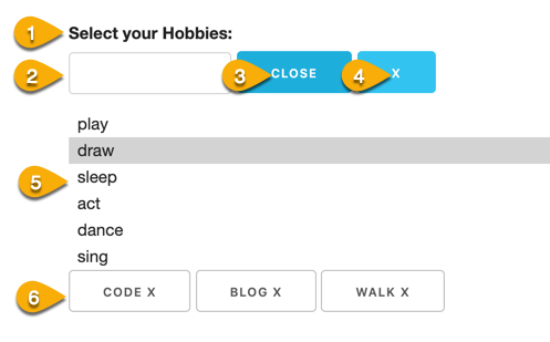
If you look closely, our multi-select example actually consists of 6 different HTML elements and their state depends on each other.

- Label
- Text input
- Toggle (list toggle) button
- Clear button
- A clickable list to select from
- A clickable list of Selected items
Why Downshift
Downshift is a library that helps us build simple, flexible, accessible react components. Its major use case is for building autocomplete and dropdown components. It is lightweight (11.5 kb) and profoundly flexible.
Building our Reusable MultiSelectDropdown
We can start by creating a React component called MultiSelectDropdown that returns the Downshift element.
We can see that we are passing not just another react component but a javascript function as a child prop of Downshift.
<Downshift /> is the only component exposed by the Downshift library. It doesn't render anything itself, it just calls the render function and renders the elements that we ask it to render.
As arguments of the children’s function, we can provide Downshift properties (state and utilities) like isOpen, getLabelProps, etc.
Downshift properties
Downshift properties can be organized as Prop getters, Actions, and State
These Downshift properties are the real power of the Downshift library. Let's see it in action.
In order to construct our accessible multi-select dropdown list, we will need to render a label, an input box, a toggle button, a clear button, a list of options and finally a list of buttons to show and cancel all selected items.
Without Downshift we’ll have to apply a lot of properties to all these elements in order to make it accessible and make them work in harmony with each other. But with Downshift writing properties to the elements is as simple as following :
For label :
|
<label {...getLabelProps()}>{labelText}</label> |
For Input :
|
<input {...getInputProps() } type="text" /> |
For Toggle Button :
|
<button {...getToggleButtonProps()}>{isOpen ? 'close' : 'open'}</button> |
Did you notice that I have access to state isOpen without writing any logic for it? Downshift provides these states without using useState.
We get access to all these properties just by passing them as arguments to our children function.
Detailed Explanation of Code
We start by creating and exporting a React component. As a prop, it gets an object with items like the list of items, the label text, a change handler which can be used in any component that uses our MultiselectDropdown. We are also spreading out the rest of the arguments to give to access remaining props.
In the children-function, we pass in all the Downshift props that we want to use in the elements that we render.
We render a label element and set its properties using getLabelProps()
We render an input element and set its properties using getInputProps()
Similarly, we render a button and we get all the important props that we should set in a toggle list button using getToggleButtonProps(). If we need to set or overwrite some additional props we can do it by passing it to the Downshift props. For example, in the toggle button, let’s say, for demonstration, we need to set className and style property. We can do it easily by passing them into the getToggleButtonProps().
We want to set the cancel button only if we have an item selected. onClick of the button we use our setSelectedItems which we declared at the top of our file using useState.
For the list of selectable items, we do the following :
- We use Downshift’s isOpen state to check if the list is visible.
- If it is visible, we filter the list of items that we will be getting as a prop from the parent component
- If an item is already selected, we filter that out.
- We filter the items from the list that includes the inputValue that the user has typed. The inputValue is a Downshift’s state. We have access to it inside all of our elements.
- In the individual list item, we use Downshift’s getItemProps() to set useful props like id, role and aria-selected
Now we, need to render buttons for all selectedItems. Those buttons when clicked will remove the item from selectedItems. At this point in time, we don’t have ready to use Downshift properties to handle them.
The above code does the following :
- We loop through all the selectedItems.
- For each item, we can render a button
- That button has an onClick handler
- When clicked, it uses our custom removeSelectedItemByIndex() to remove that item from the selectedItems.
Outside the Downshift element, I’ve just rendered the selectedItems state, so we can visually see what’s happening without opening the console.
MultiSelectDropdown is now our reusable component.
As per the author of Downshift, Kent C Dodds, the purpose of these highly flexible, low-level, unopinionated libraries are to facilitate the making of a more opinionated, high-level reusable components.
We have just created one. Let’s see how to actually use it. You will be surprised to see, how easy it is to use such a complicated component.
|
<MultiSelectDropdown |
|
const hobbiesArray = [ |
Remember the ...rest prop in our MulitSelectDropdown. Thanks to that, that itemToString gets to set a prop to the Downshift component.
Whenever selectedItems change, onSelectionItemsChange is fired, which in turn executes the function returned by handleHobbySelect.
handleHobbySelect can be used for any kind of effects or side effects like...
In this post, we have created a user-friendly multi-select dropdown using Downshift. I’ll encourage you to keep an eye on the Downshift hooks API as they are going to make using and extending Downshift much simpler.

Vivek Agarwal, Frontend Trainer
He's a extroverted introvert (there is such a thing) who spends his free time studying with his daughter or singing in the shower.

 We respect your privacy. Your information is safe.


Leave us a comment