Introduction
The metrics and tools we use to decide if a website is fast have evolved significantly. Today, if you check reports from Google Measure, you will find tests that check for unused CSS, fonts usage, next-generation images, reduce JavaScript parsing and execution time, etc.
A website’s loading performance on a browser is now further analyzed across several micro-metrics to squeeze those last seconds and milliseconds.
Let's look at some of the best-kept tricks that can improve your site’s user experience. Some of the tips here might not improve your page load times, but they will bring a change in the “user-centric performance.”
User-centric performance means analyzing perceived performance and responsiveness after page load or time to interactive, visual stability, and smoothness. It is often the case that the user perceives a smooth loading and responsive website as fast even though it takes a second or two more to load as per reports. However, it perceives a website as slow, which has a sudden shifting of elements and slow JS execution, even if the initial page load was a couple of seconds faster.
Let’s see how we can improve the experience for users.
Fonts usage
Web font optimization is a topic on its own, but let’s cut right to a few essential points:
Only use the fonts that you need. Each font contains glyphs that tell your browser how to render a letter/character in that font. Most fonts have glyphs for multiple languages in them; if our site is not going to have multiple languages on your site, we can exclude those extra glyphs in those font files. For example, an English site doesn’t need Greek letters. This will save us on the bytes required to be downloaded by the browser.
Font-display
font-display property tells browsers how to handle the website’s content until your font is getting downloaded.
Why is this important? We first need to understand two terms - FOUT (“flash of unstyled text”) and FOIT (“flash of invisible text”).
font-display provides various attributes that can tell your browser how to manage them.
The default value for this property is font-display: block, which tells the browser to paint the text transparently until fonts are available. But, if you use the swap or fallback methods, it often improves the experience for the end-user.
font-display: swap instructs the browser to show the text in a fallback font (first paint) until the time custom font is available, and when it is, the browser swaps them.
font-display: fallback is the middle road between swap and block, where the browsers wait for a short duration of 100ms for checking if fonts are available, hiding the text in this period. If, after 100ms, the fonts are still downloading or not available, it will go back to the swap method.
As both these methods instruct the browser to start painting the text sooner, users see something on the page earlier rather than a white browser window. Playing with font-display often increases the perceived performance of the site for the end-user.
Image lazy load
Another critical aspect of making the page lighter is not loading any media until the user is actually going to see it. We are talking about the content below the fold or below the user’s viewport, which is especially true for mobile devices. Tools like PageSpeed can penalize if you are loading too many images below the fold.
However, this can be handled very easily, thanks to a not so widely used ability of <img> tag.
The src attribute of <img> tag also takes in the “encoded value of an image.” This means the browser doesn't have to download that image; it can reconstruct or decode that image while rendering on its own.
We can use this to stash our actual image in a data-src attribute and show the encoded placeholder image everywhere. This makes our page load is very light as the browser doesn’t have to download assets not seen by the user. As the user scrolls or is about to view the image, we swap the placeholder with the actual image in data-src.
There are many third-party JS libraries like blazy and lazysizes that can offload this logic for you.
This is also now getting native support by browsers via the loading attribute. However, not all browsers support this feature yet.
Using a picture element
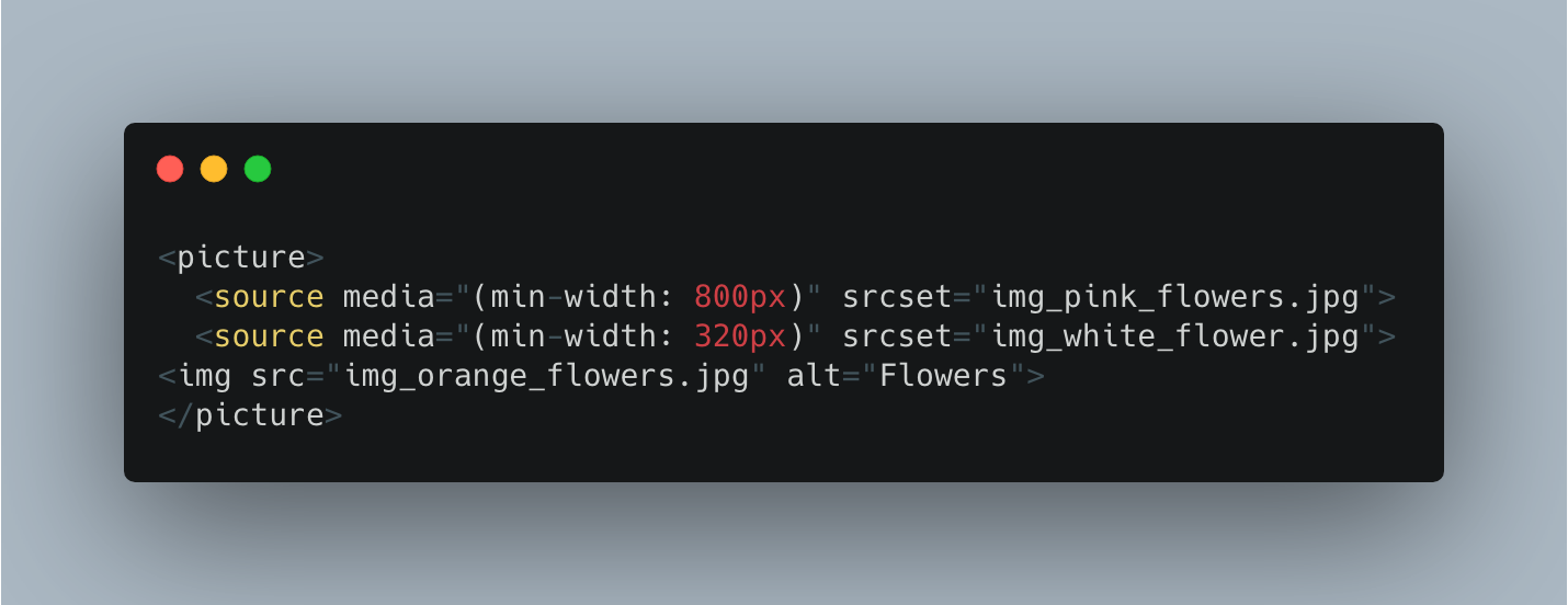
The picture tag is the new way to manage images. With the onset of responsive design, there was a need for responsive images as well. HTML5 provides a native way to handle responsive images using <picture>.

We can combine the picture elements with lazy loading for even better results.
Next Generation Image formats
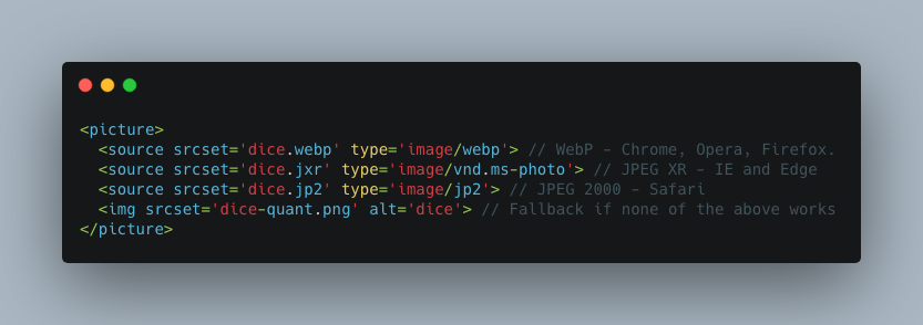
JPEG 2000, JPEG XR, and WebP are image formats with superior compression and quality characteristics compared to their older JPEG and PNG counterparts. Encoding your images in these formats rather than JPEG or PNG means that they will load faster and consume less cellular data.
However, no single format works in all browsers, while WebP has the best multi-browser support.
You can use the picture tag here as well, and browsers will choose the image format as per their support.

If image processing on the server is impossible, we can also use CDN services like Cloudflare, which will convert images based on the browser’s user agent on the fly!
JavaScript Performance
As part of this cheat sheet, let's see some quick wins we can do.
We should keep in mind that JavaScript is one of the most resource-intensive assets we add to a web page. If not done properly, it can severely affect interactivity and introduce bottlenecks.
Some useful tips are as follows:
- Don't attach all the JS in one file and on all pages.
- Instead, use component architecture to attach JS selectively in bits and pieces along with the components that need it. This will improve download times and CPU costs, especially on mobile devices.
- Avoid unnecessary resource-intensive JS on Page load; instead, use events and triggers smartly.
- Avoid inline JS as much as possible, it blocks the main thread, and inline scripts have very little to no caching.
- Keep an eye on your scroll and resize events; use ResizeObserver, IntersectionObserver, to slow them down.
- Avoid multiple event handler attachments; use once().
- Avoid wholesale markup changes and movements via JS; we often use JS to clone and inject JS; these components usually start in a different place on page load and end up in the other place after JS is loaded, resulting in a very unpleasant UX.
- Limit external libraries.
JavaScript async-await and async/defer
Recent additions to the JavaScript world of ECMAScript 2017 are async and await keywords.
async, along with await, make JavaScript code more modern; it is now possible to pause our code using await expecting a Promise. While this Promise is fulfilled, other JS code can be executed. This better utilizes the wait times and improves performance in what would otherwise become a synchronous process.
Also, async and defer are two newer attributes we can add to our script tag to tell the browser how we want our JS to be parsed and executed. By default, whenever the browser encounters a script tag, it pauses HTML parsing, fetches the JS, and starts executing it.
async allows us to tell the browser to download the file in parallel to HTML parsing and not block it. Once the JS file is available, then parsing is stopped, and JS is executed. On the other hand, Defer tells the browser to download in parallel but doesn’t execute until all HTML parsing is complete.
Based on your JS requirements, both these concepts are important tools to tweak how your browser executes JS.
Unused CSS
Unused CSS is again a result of how styles are shipped inside most frameworks and, further, how they are aggregated and loaded. Something not many tests flagged a few years ago.
Like JS, our CSS files contain styles that need to be parsed by the browser; unused CSS means the number of lines that have no impact on a particular page but still are part of the CSS file loaded on the page. Example: Say we have a 'My Account' page on our site, if we load all the styles of the 'My Account' page on our Home page, they would be flagged by the browser as unused as those HTML selectors don’t exist. Hence, such style rules are an overhead.
We can use the component approach again for improving this metric and attach styles and build style sheets as part of components to avoid a single global file. We can never achieve 100% results here, but the more you can reduce the unused CSS from the browser, the lighter your page becomes.
Cache Headers and Browser Network Panel
Browser network panel is not a metric but a tool to audit our page request and see what and how much of it can be cached.
As per Google Source, Among the top 300,000 sites (by Alexa rank), the browser can cache nearly half of all the downloaded responses, which is a huge saving for repeat Page Views. Of course, that doesn’t mean that your particular application can cache 50% of the resources.
We should always check our Browser network panel to see what are the different images, CSS, JS, and Fetch/XHR is happening on a particular page. Check if all static assets have proper cache headers. Cache headers tell the browser how long a particular response can be cached for before it is invalidated and requested again in fresh.
We can control if something can be cached by the browser, if the cache is public or private, how long before it is refreshed or if something needs to be fetched on every page request.
Resource Prioritization
Browser assigns a priority for every resource it downloads; you can see this in the network panel in Google Chrome. By default, CSS is Highest, followed by JS, which is High.
However, if we use async for the JS script tag, the browser would change the priority to low. Browers pay attention to such attributes and change the priority of the corresponding resource while downloading.
Similar to how we had async/defer for script tags, we have prefetch, preload, and preconnect for link tags. Along with these attributes, we also use them as a parameter to inform the browser of what kind of resource we are requesting.
Preload tells the browser to download this resource and make it available ASAP, ex: fonts.
Preconnect tells the browser we would soon need to establish a connection to another origin. You instruct the browser to start doing DNS lookups, handshakes, and redirects as soon as possible.
Prefetch is more like a gentle nudge to the browser to inform that the browser should download a low-priority resource if it gets a chance to do so. This is essentially a preemptive way to fetch resources for something that the user is not currently doing but might do. For which we wish to prepare our browser ahead of time.
If the above ten techniques are followed, we can make tangible improvements to any website’s front-end performance. I wish to explore each topic in more detail in upcoming blog posts.
Here's a QA Checklist For Testing Advanced Frontend Elements and another for Testing Basic Frontend Elements.

Swarad Mokal, Technical Program Manager
Big time Manchester United fan, avid gamer, web series binge watcher, and handy auto mechanic.

 We respect your privacy. Your information is safe.


Leave us a comment